Data Mapping Diagram with AI sounds niche until a migration breaks, a warehouse table goes sideways, or two teams discover that “customer_id” means three different things. Then it becomes urgent. A good map does not just show where data starts and where it lands. It shows meaning, joins, filters, renames, calculations, and the logic that keeps your pipeline from turning into forensic archaeology six weeks later.
That is why this matters. A data mapping diagram gives structure to the messy middle between source and target. In classic data management work, mapping sits at the center of migration, integration, transformation, and warehousing. Research on schema matching and mapping has treated correspondences between schemas as a foundational problem for data integration for more than two decades, and later work on mapping visualization showed why teams need those relationships rendered clearly when complexity grows. Jeda.ai brings that logic into an AI Workspace and AI Whiteboard so you can move from scattered notes to an editable, collaborative visual in one place.
And yes, there is a practical upside. Instead of documenting the mapping in one tool, debating it in another, and redrawing it in a slide deck later, you can build the whole thing in Jeda.ai’s Visual AI workspace, extend it with the AI+ button, and keep the reasoning visible. That is a far better way to review data movement with engineers, analysts, and stakeholders than another heroic spreadsheet.
What is a data mapping diagram?
A data mapping diagram is a visual model of how data moves from one structure to another. At the simplest level, it links source fields to target fields. In more serious work, it also captures transformation rules, business logic, joins, intermediate steps, and validation checkpoints. Talend defines data mapping as matching fields from one database to another, while Lucidchart frames data mapping as the visual work that helps teams standardize and consolidate data from many systems into a usable structure. Academic work goes even deeper: Rahm and Bernstein described schema matching as the task of generating correspondences between schema elements, and later work on mapping visualization focused on making those connections understandable at scale.
So a data mapping diagram is not just a picture. It is a shared operational model.
That distinction matters when you are handling CRM migration, SaaS-to-warehouse pipelines, ERP modernization, product analytics, or anything else where source and target do not line up cleanly. A spreadsheet can list mappings, sure. But a diagram makes dependencies obvious. It surfaces where one target column depends on two source fields, where a lookup table sits in the middle, or where a filter quietly changes the business meaning of a metric.
In Jeda.ai, that visual logic becomes editable. You can create the first version using the diagram recipe, refine it with the Diagram or Flowchart command, and then use Vision Transform when you want to reframe the same logic as a mind map, a more linear process, or a document-style explanation.
- Clarify source-to-target logic
Show where each field comes from, where it lands, and what transformations happen in between so the mapping is reviewable instead of implied.
- Expose hidden complexity
Visualize joins, filters, lookups, intermediate objects, and validation rules before the implementation team discovers them the hard way.
- Turn mapping into collaboration
Build the diagram in Jeda.ai’s AI Whiteboard so analysts, engineers, and stakeholders can comment, revise, and extend the same artifact.
Why use Data Mapping Diagram with AI instead of drawing it manually?
Because manual mapping work usually breaks in familiar, annoying ways.
One person understands the business fields. Another person understands the source schema. Someone else knows the warehouse naming rules. The final mapping lives in tabs, meeting notes, sticky comments, and tribal memory. Then the handoff starts. Not elegant.
Using Data Mapping Diagram with AI changes the starting point. You give Jeda.ai the context, the sources, the target, and the purpose of the pipeline. It gives you a first-pass visual structure you can inspect, edit, and deepen. That does not replace technical judgment. It removes the blank page and speeds up the part no one should still be doing from scratch.
The stronger play is not “let AI guess everything.” The stronger play is “let AI draft the structure, then let the team sharpen it.” That is where a Visual AI workflow actually earns its keep.
There is also a strategic reason to do this visually. Lucidchart’s own guidance emphasizes that visual data maps help teams understand data flow and interpret what the data is doing. Research on schema-mapping visualization makes the same point from a more formal angle: once mappings get large, the problem is not only defining them but making them legible. Jeda.ai is useful here because the output is not a frozen artifact. It is an editable AI Workspace with connectors, nodes, notes, and room to extend.
How to create a Data Mapping Diagram in Jeda.ai
If your goal is a fast, structured result, use the AI Menu recipe first. That should be your default route here because the Data Mapping Diagram recipe already frames the thinking correctly. Then use the Prompt Bar when you want a faster, more flexible pass or when you already know exactly how you want to phrase the mapping.
Method 1: Use the diagram recipe in the AI Menu
This is the recommended path.
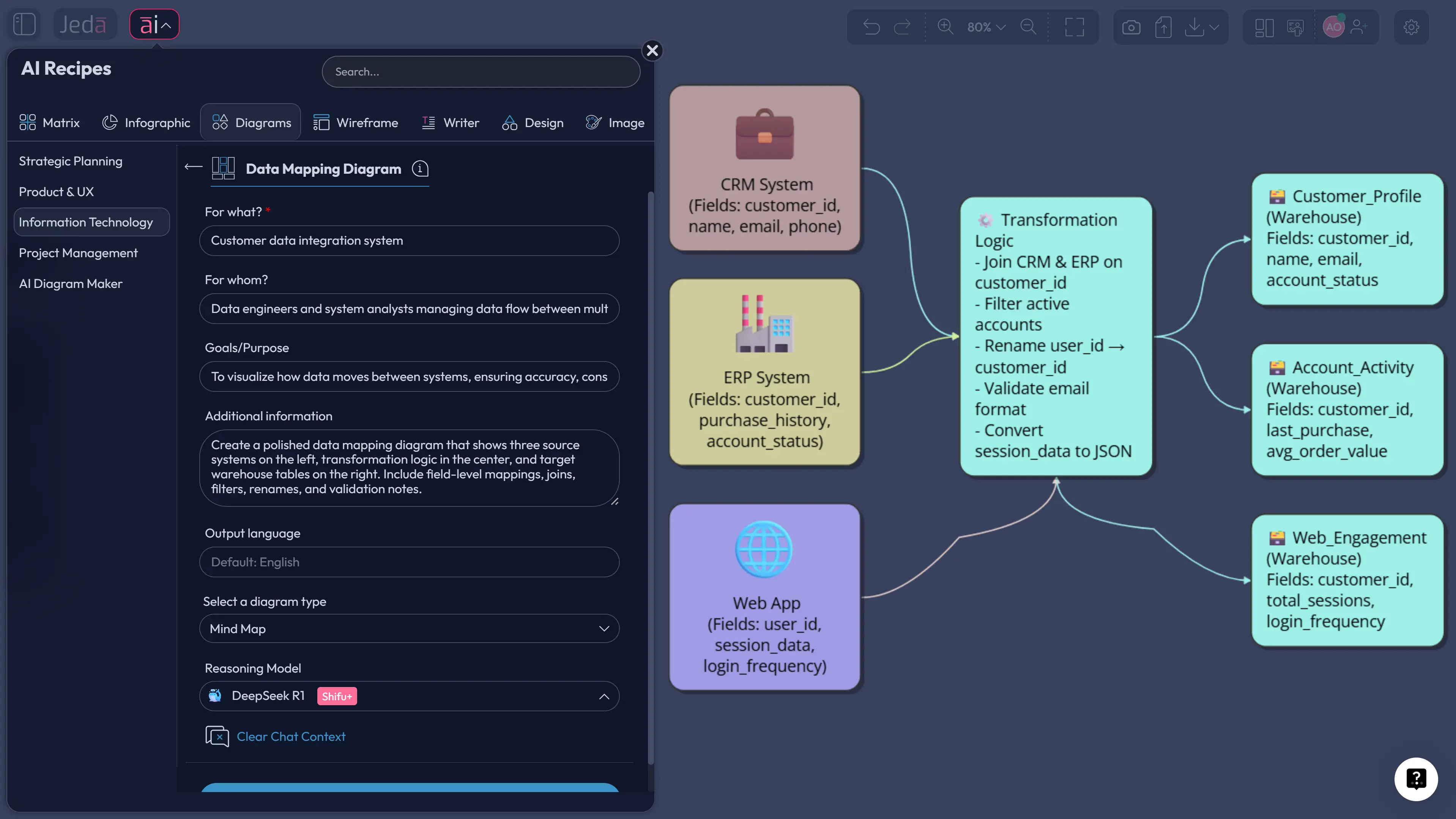
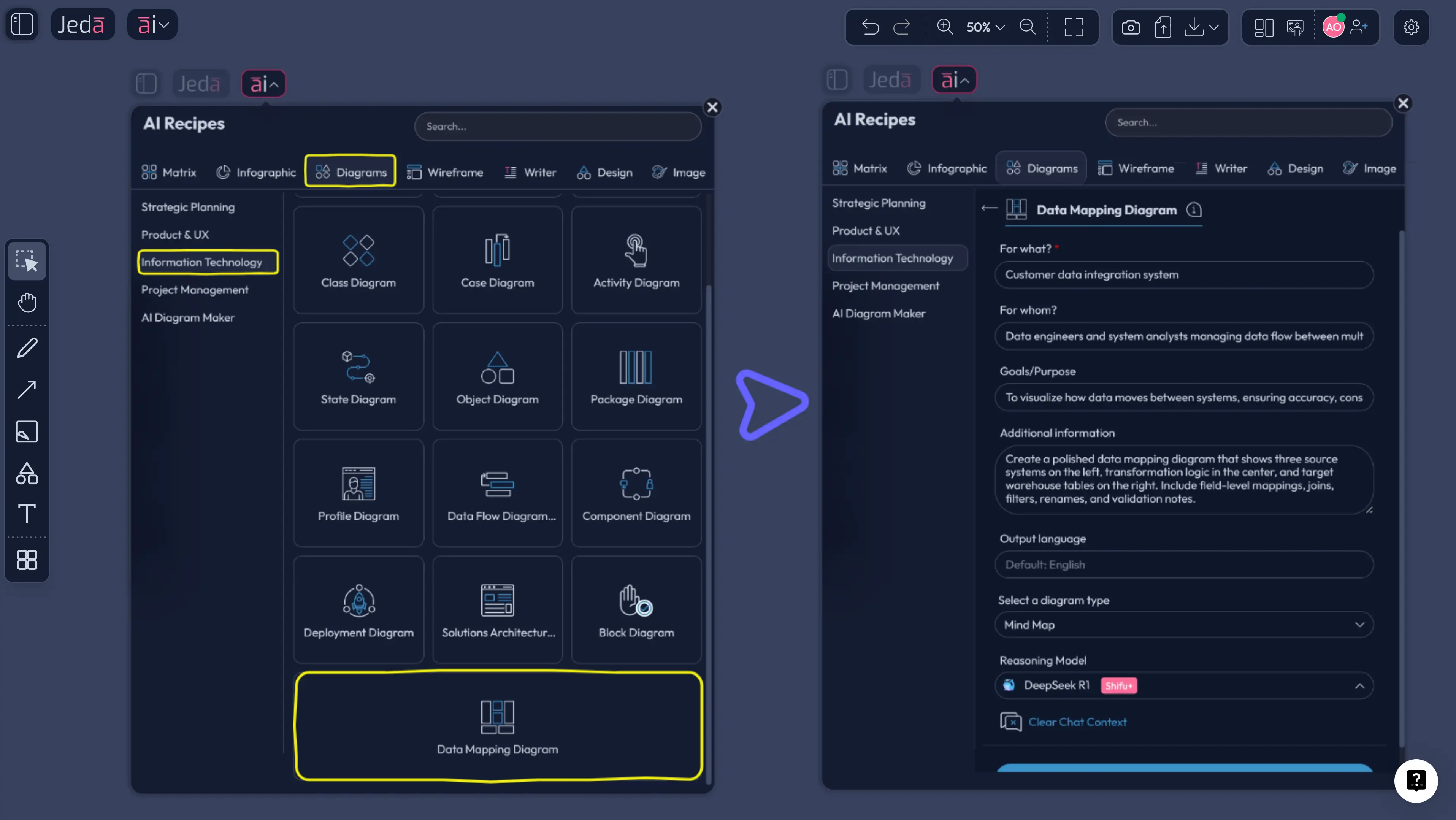
Open the AI Menu from the top-left, go to Diagrams, choose the Information and Technology category, and select Data Mapping Diagram. The recipe form gives you the fields that matter for this kind of work: For What?, For Whom?, Goals/Purpose, and More Context. It also lets you choose a Horizontal or Vertical layout, turn Web Search on when you need outside context, choose the diagram type as Basic Diagram, Mind Map, or Flowchart, and pick the reasoning model that fits the job.
That matters because the recipe nudges the prompt toward structure. Instead of typing vague instructions, you are filling in the bones of a real source-to-target mapping problem. Jeda.ai then turns that into an editable diagram you can keep refining inside the AI Whiteboard.
- Open the AI Menu and choose the recipe
Click the ai∨ menu, go to Diagrams, open the Information and Technology category, and select Data Mapping Diagram.
- Describe the mapping problem clearly
Fill in For What, For Whom, Goals/Purpose, and More Context with the source systems, target system, business goal, and any required transformations or validation rules.
- Set the visual structure
Choose Horizontal or Vertical layout, then pick the diagram type: Basic Diagram for flexible mapping views, Mind Map for exploratory breakdowns, or Flowchart for more step-based transformation logic.
- Choose model and generate
Select the reasoning model, turn Web Search on if outside grounding helps, and generate the first-pass mapping board.
- Refine the output with AI and manual edits
Edit labels, add connectors, clarify rules, and use the AI+ button to deepen the mapping. Use AI+ for extension and enrichment, not for ultra-specific one-off instructions.
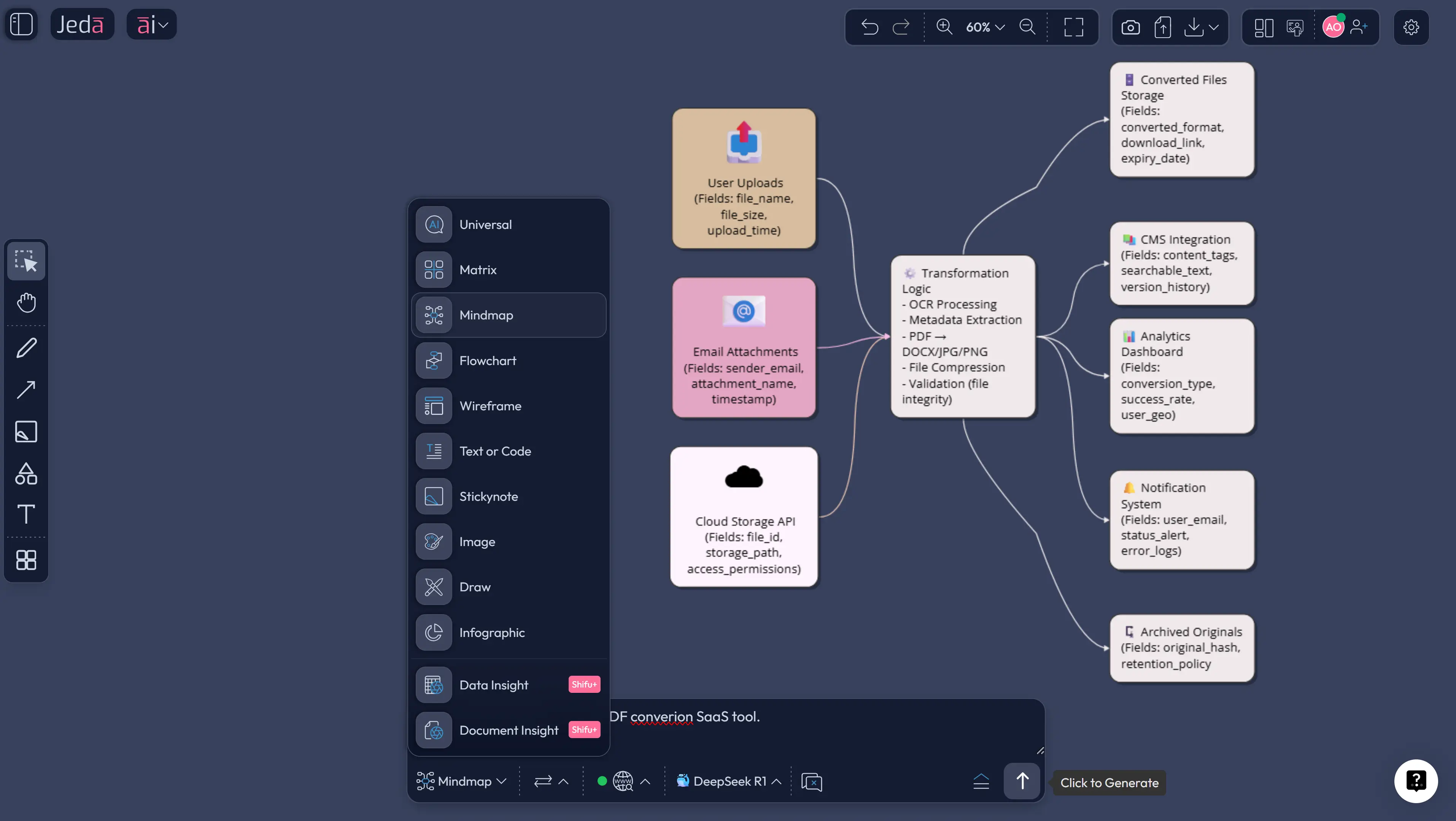
Method 2: Use the Prompt Bar for a faster custom build
Sometimes you do not want the recipe guardrails. You just want to tell the system what to map and get moving. That is where the Prompt Bar helps.
Open the Prompt Bar at the bottom of the canvas, select the Diagram command for a flexible mapping structure, and write the problem in plain English. If your mapping is sequential and transformation-heavy, the Flowchart command can work better. If you are still breaking down domains and entities, you can even start with Mindmap and use Vision Transform later to convert the structure.
The key is specificity. Tell Jeda.ai the source systems, the target model, the major entities, the transformations, and the output style you want. Do not just say “make a data mapping diagram.” That is how you get something generic. Say what is being mapped, why it exists, and what rules the destination must follow.
- Open the Prompt Bar and select a command
Choose Diagram for flexible source-to-target mapping, or choose Flowchart if you want a more stepwise transformation view.
- Write a concrete prompt
Name the source systems, target tables or objects, key entities, business purpose, transformation logic, and any required joins, validations, or naming standards.
- Set layout and generation context
Pick Horizontal or Vertical layout where relevant, switch Web Search on only if current external context is useful, and select the reasoning model.
- Generate and inspect the first draft
Review whether the output captures source fields, target fields, intermediate logic, and dependencies clearly enough for a technical review.
- Extend and transform when needed
Use the AI+ button to add more downstream mappings, edge cases, or validation branches. Use Vision Transform if you want the same logic reframed as another visual type.
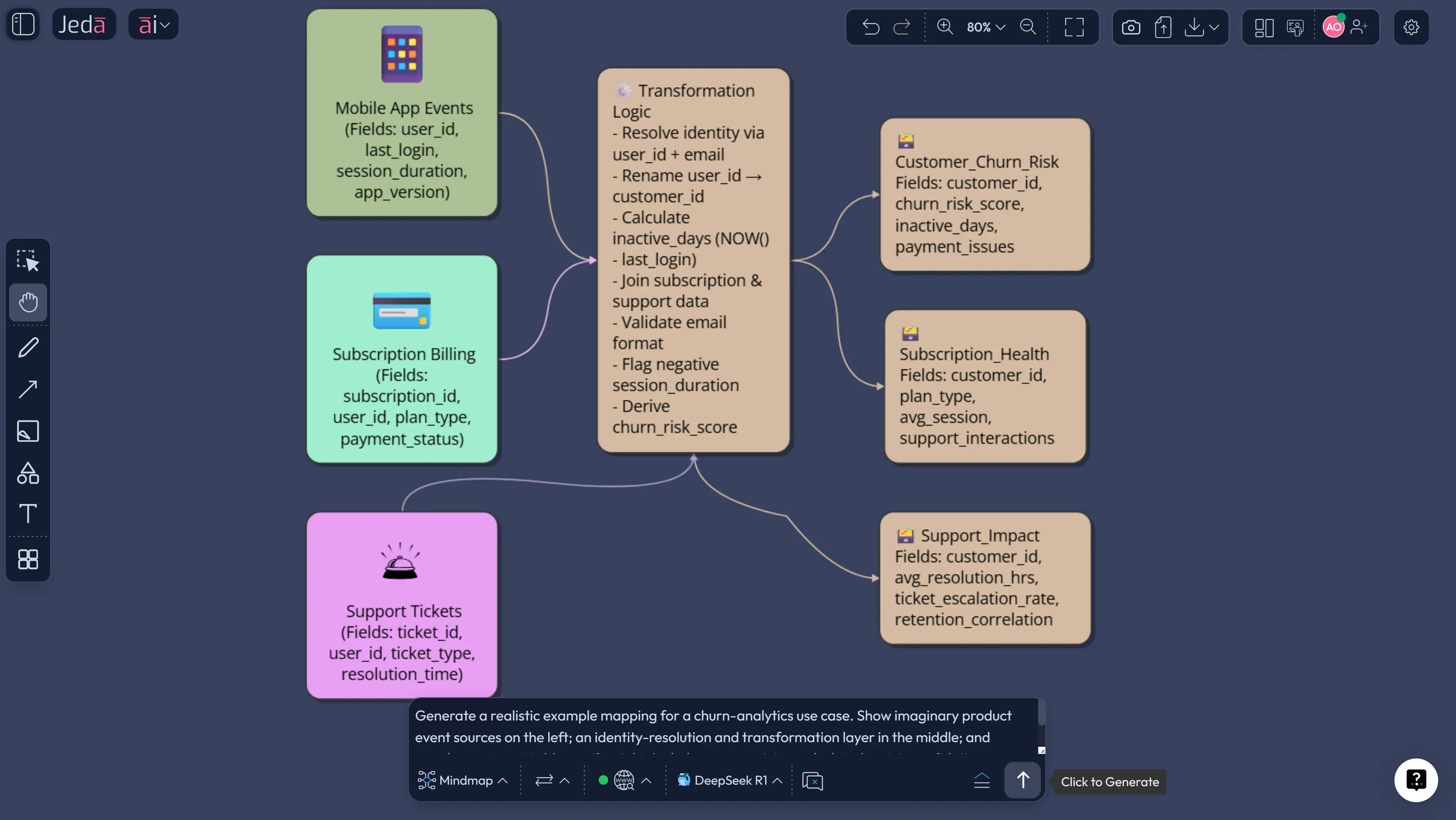
Example use case: map CRM, billing, and product data into one analytics model
Let’s make this real.
Imagine you need to combine HubSpot contact data, Stripe billing data, and product usage events from your app into a warehouse model that supports churn analysis. The business question sounds simple: “Which customers are likely to churn?” The data reality is not. Names are inconsistent, IDs live in different places, timestamps use different formats, and your target model wants clean dimensions and facts.
This is exactly where a Data Mapping Diagram with AI earns its keep.
You would define the source systems on the left, the target warehouse entities on the right, and the transformation logic in the middle. One branch might map hubspot_contact.id to customer_dim.crm_contact_id. Another might join Stripe subscriptions with internal account IDs through an intermediate identity table. A third branch might transform raw usage events into weekly engagement aggregates before landing in a fact table. Suddenly the mapping is no longer a document someone has to explain from memory. It is visible.
And once it is visible, better questions show up. Which field is the real business key? Where do nulls need handling? Should cancellation date come from Stripe status changes or an internal account event? Which transformations are descriptive, and which ones change business meaning? That is the part teams often skip. The diagram forces it into the open.
If the first draft is too broad, narrow the prompt. If it is missing edge cases, use the AI+ button to deepen the areas that matter. If the team wants a more linear walkthrough for implementation, use Vision Transform to convert the board into a Flowchart. That is the practical advantage of working in Jeda.ai instead of producing a static diagram somewhere else and then redrawing it later in your AI Whiteboard workflow.
Best practices that make data mapping diagrams actually useful
Pretty diagrams are easy. Useful diagrams are rarer.
The difference usually comes down to whether the diagram captures business meaning, not just field movement. A source-to-target map should show why a transformation exists, not merely that it exists. If a field is standardized, filtered, or merged, say so. If a metric is calculated, label the logic. If an intermediate table resolves identity or deduplicates records, make that visible.
Common mistakes to avoid
The first mistake is treating every mapping as one-to-one. Real data rarely behaves that politely. One target field may come from two sources, a lookup, and a rule. Pretending otherwise gives you a clean diagram and a broken implementation.
The second mistake is mixing process flow and schema mapping without telling the viewer which is which. If you need both, either label the layers clearly or create two linked views in the same Jeda.ai workspace.
Third: burying business rules in meeting notes. If a mapping depends on “active subscription means paid in the last 30 days unless enterprise contract exists,” that rule belongs on the board.
And finally, teams often stop at the first decent draft. Do not do that. The draft is the start. Review it with the people who know the source data, the destination model, and the reporting logic. Then extend it with AI+, tighten it manually, and keep the board alive.
Frequently asked questions
- What is a data mapping diagram used for?
- A data mapping diagram is used to show how data moves from source systems to target systems, including field matches, transformations, joins, and validation logic. Teams use it for migration, integration, warehousing, and analytics work because it makes implementation rules visible before development starts.
- Is a data mapping diagram the same as source-to-target mapping?
- They are closely related, but not always identical. Source-to-target mapping usually focuses on the implementation specification, while a data mapping diagram turns that logic into a visual model that is easier to review, discuss, and refine across technical and business teams.
- When should I use Diagram versus Flowchart in Jeda.ai?
- Use Diagram when you need a flexible source-to-target structure with multiple relationships across entities, tables, and rules. Use Flowchart when the emphasis is the sequence of transformation steps, handoffs, or decision points rather than the mapping relationships themselves.
- Can Jeda.ai generate a data mapping diagram from a file?
- Yes, but the route depends on your input. If you already have a structured file or document that explains the mapping context, Jeda.ai can use Data Insight or Document Insight workflows as supporting input and then render the output in an editable visual format.
- Can I edit the diagram after Jeda.ai generates it?
- Yes. That is one of the main advantages. Jeda.ai outputs editable visuals for Diagram, Flowchart, Mindmap, Matrix, Text, and related commands, so you can adjust labels, structure, connectors, and formatting directly on the canvas after generation.
- What should I include in the prompt for better results?
- Name the source systems, target schema or tables, core entities, transformation rules, required joins, validation checks, and the business purpose of the mapping. The better your context, the less generic the first draft will be and the easier it will be to review.
- What is the fastest way to create one in Jeda.ai?
- The fastest structured route is the AI Menu recipe because it prompts you for the right inputs and sets the diagram context correctly. The Prompt Bar is faster when you already know the mapping problem clearly and want a more custom first draft.
- Can AI+ add more detail to an existing mapping?
- Yes. AI+ is useful for extending an existing board with more entities, downstream branches, validations, or related transformation logic. It works best when the current structure is already solid and you want depth, not when you need hyper-specific microscopic edits.
- Why not just document mappings in Excel?
- You can, and many teams still do. But visual diagrams reveal dependencies, joins, and business logic faster, especially when several people need to review the same mapping. A board in Jeda.ai also stays editable and collaborative instead of living as a static handoff document.
Sources & further reading
- [1]
Talend (n.d.) . “What is Data Mapping? Definition and Examples” Talend Resource Center.
View Source ↗ - [2]
Erhard Rahm; Philip A. Bernstein (2001) . “A Survey of Approaches to Automatic Schema Matching” The VLDB Journal.
View Source ↗ - [3]
Philip A. Bernstein; Jayant Madhavan; Erhard Rahm (2011) . “Generic Schema Matching, Ten Years Later” Proceedings of the VLDB Endowment.
View Source ↗ - [4]
George G. Robertson; Mary P. Czerwinski; John E. Churchill (2005) . “Visualization of Mappings Between Schemas” CHI 2005.
View Source ↗ - [5]
Laura Mazilu et al. (2022) . “Schema Mapping Generation in the Wild” Information Systems.
View Source ↗
Start building your Data Mapping Diagram with AI
Join 150,000+ users who use Jeda.ai to turn data, documents, and ideas into editable visual workflows.
Try Jeda.ai Free