Most root-cause sessions fail before the first sticky note lands. Not because the team lacks intelligence. Because the room rewards confidence, volume, and whoever has the sharpest anecdote. An Ishikawa Diagram with AI changes that rhythm: it gives teams a structured way to map possible causes, separate evidence from hunches, and turn messy debate into a visible cause-and-effect system.
That matters because the Ishikawa Diagram, also called a Fishbone Diagram or Cause-and-Effect Diagram, was built for exactly this kind of work: finding possible causes behind a visible problem. ASQ describes it as one of the Seven Basic Quality Tools and a way to sort possible causes into useful categories during brainstorming. The old-school version still works. But inside Jeda.ai, the framework becomes faster, editable, collaborative, and easier to expand without losing the logic.
Jeda.ai is an AI Workspace and AI Whiteboard for teams that need Visual AI, not another blank canvas. You can generate a Fishbone Diagram from the guided Ishikawa Diagram (Fishbone) recipe under Quality & Process Improvement, or you can build one directly from the Prompt Bar. Use the recipe when you want structure. Use the Prompt Bar when you want speed. Use both when the problem is expensive enough to deserve real thinking.
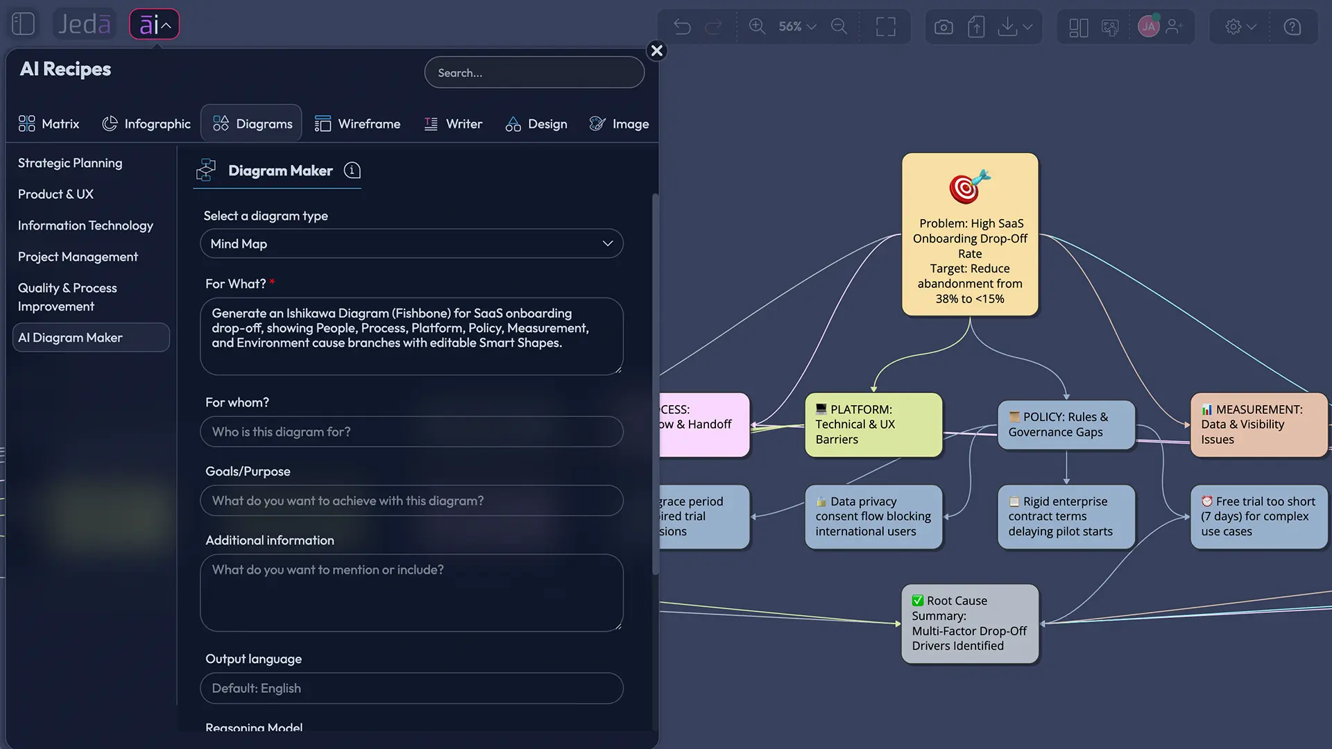
What is an Ishikawa Diagram?
An Ishikawa Diagram is a cause-and-effect diagram that helps teams identify possible causes behind a specific problem. The problem sits at the “head” of the fish, while major cause categories branch into smaller causes along the spine.
Kaoru Ishikawa popularized the method in quality management, and the diagram became one of the most recognizable tools in root-cause analysis. It is simple on purpose. That is its superpower and its trap. A Fishbone Diagram can pull hidden causes into the open, but it does not automatically prove which cause matters most. You still need data, judgment, and follow-up validation.
That is where AI becomes useful — not as an oracle, but as a thinking partner. In Jeda.ai, an Ishikawa Diagram is not a static template. It becomes an editable visual system where teams can add causes, reorganize categories, compare perspectives, and use Web Search when fresh context matters. The result is less “we made a diagram” and more “we can now run the next diagnostic step without arguing in circles.”
Why create an Ishikawa Diagram with AI?
Creating an Ishikawa Diagram with AI helps teams move from opinion-led brainstorming to structured investigation. AI can suggest cause categories, surface overlooked variables, and turn scattered notes into a clean, editable fishbone.
Here is the uncomfortable truth: most teams do not need more brainstorming. They need better containment. A support team knows ticket volume is rising. A factory knows defect rates are climbing. A product team knows users are dropping during onboarding. The hard part is not naming the symptom. The hard part is seeing the system around it.
Jeda.ai gives that system a shape. As an AI Workspace, it lets you pull together subject, scope, participation context, timelines, improvement areas, and additional information before generation. As an AI Whiteboard, it keeps the output visual and collaborative. And with 300+ strategic frameworks, Jeda.ai lets root-cause work connect to nearby methods like 5 Whys, PDCA, SIPOC, Value Stream Mapping, and corrective-action planning.
- Structure the chaos
Turn a broad problem into cause categories, subcauses, and visible relationships instead of a pile of disconnected notes.
- Challenge blind spots
Use AI to suggest causes the team may miss, then validate them with data, customer evidence, process logs, or frontline input.
- Make RCA collaborative
Keep the fishbone diagram editable on a shared canvas so operations, product, quality, and leadership can work from the same visual source.
When should you use an Ishikawa Diagram?
Use an Ishikawa Diagram when the problem is clear, but the causes are not. It is strongest when a team needs to explore several possible cause families before choosing where to investigate deeper.
Good fits include recurring defects, delayed delivery, customer complaints, onboarding drop-off, missed SLAs, rework loops, safety incidents, process variation, or quality escapes. A Fishbone Diagram also works well before 5 Whys. The fishbone gives you the map; 5 Whys digs into one branch.
Avoid using it when the team already has a verified root cause and only needs action planning. In that case, move to PDCA or corrective action. Also avoid treating a beautiful fishbone as proof. It is a hypothesis map. Pretty bones, still bones.
How to create an Ishikawa Diagram in Jeda.ai
Jeda.ai gives you two practical ways to create an Ishikawa Diagram with AI. The recommended method is the guided Diagram Recipe, because it captures the context that root-cause analysis usually needs. The faster method is the Prompt Bar, which is useful when you already know the problem statement and want a quick first draft.
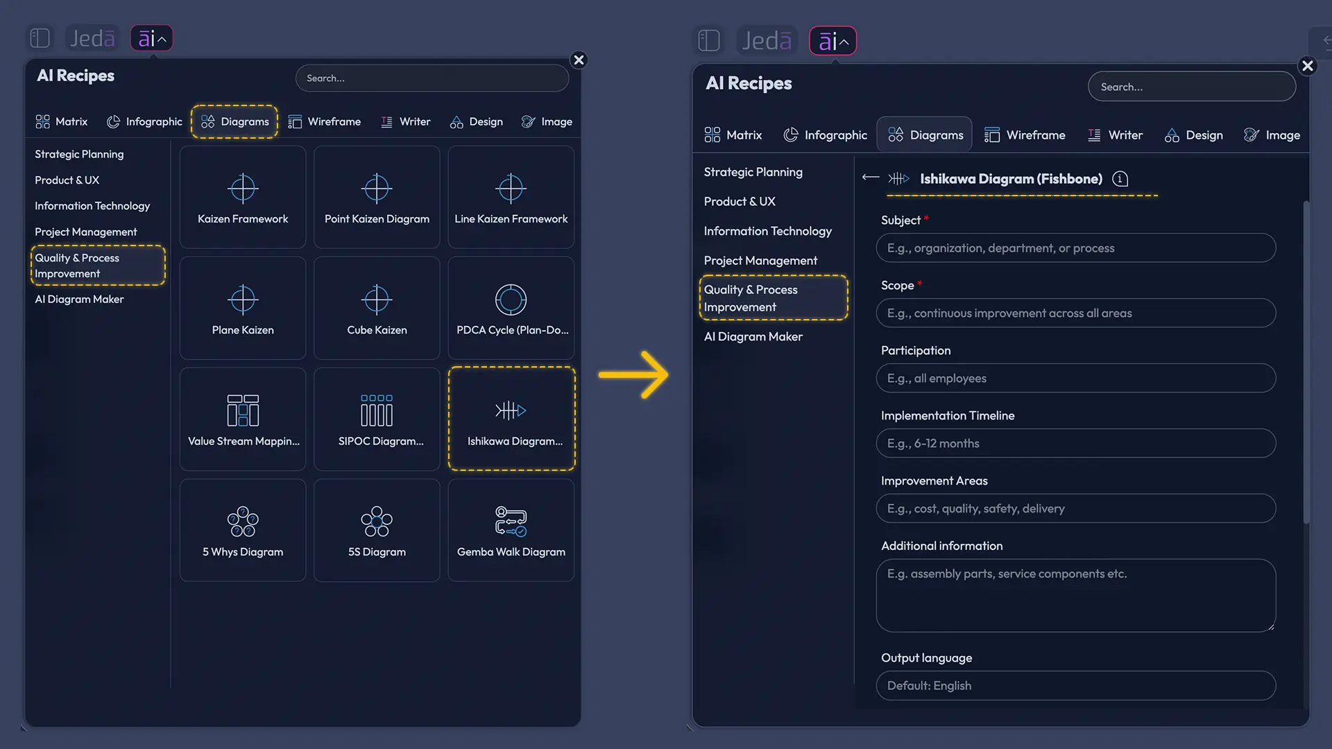
Method 1: Use the Ishikawa Diagram Recipe in AI Menu
The Diagram Recipe is the better workflow for serious root-cause analysis. It forces the right inputs before the diagram appears, which means the output is less generic and more useful.
Open the AI Menu, go to the Diagrams tab, then choose the Quality & Process Improvement category. Select Ishikawa Diagram (Fishbone). The recipe uses common fields: Subject, Scope, Participation, Implementation Timeline, Improvement Areas, and Additional Information. These fields are not decoration. They are the difference between “late delivery causes” and “late delivery causes for Q2 enterprise orders in the Northeast region, involving warehouse, logistics, customer success, and supplier handoff.”
Then choose the layout. A horizontal layout usually matches the classic fishbone pattern. A vertical layout can work better when the diagram needs to fit a narrow content area or when you want a management-review format. Choose the diagram type: Basic Diagram, Mind Map, or Flowchart. For a classic Fishbone Diagram, start with Basic Diagram. Use Mind Map when you want an exploratory cause tree. Use Flowchart when the problem is tied to a process sequence.
Turn Web Search on when the analysis depends on current external context, such as new compliance requirements, market conditions, industry benchmarks, or recent incidents. Keep it off when the work should stay grounded in internal data only. Then choose the AI model that fits the depth you need and generate the diagram.
- Open the AI Menu
Click the AI Menu in the top-left area of the Jeda.ai workspace and open the Diagrams tab.
- Choose the right recipe category
Go to Quality & Process Improvement and select Ishikawa Diagram (Fishbone).
- Fill in the recipe fields
Add the Subject, Scope, Participation, Implementation Timeline, Improvement Areas, and Additional Information so the AI understands the real operating context.
- Select layout and diagram type
Choose horizontal or vertical layout, then select Basic Diagram, Mind Map, or Flowchart based on how you want the cause structure to appear.
- Set Web Search and AI model
Turn Web Search on when external context is useful, keep it off for internal-only analysis, and choose the reasoning model for the generation.
- Generate and review the fishbone
Click Generate, inspect the major cause branches, edit Smart Shapes, rename categories, and remove weak assumptions.
- Use AI+ to extend
Select an existing branch and use AI+ to extend or deepen it when the first diagram needs more detail.
Method 2: Create an Ishikawa Diagram from the Prompt Bar
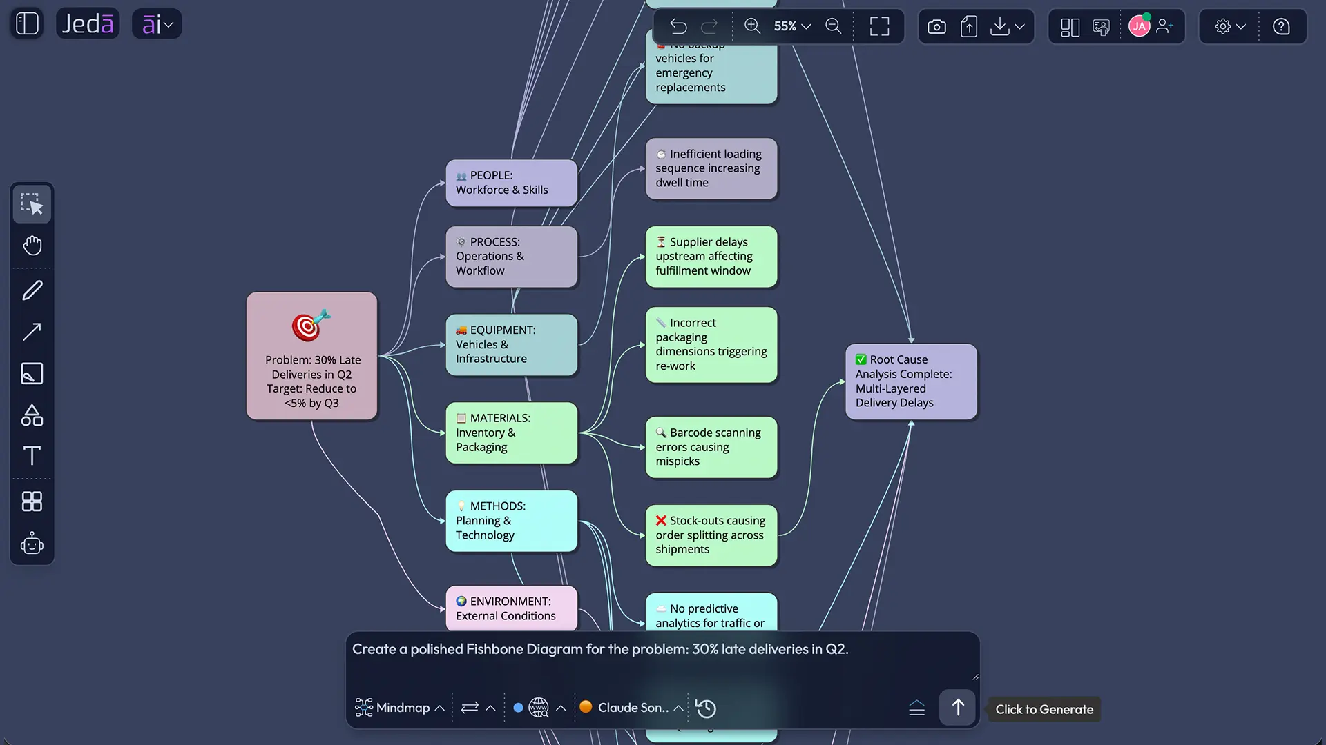
The Prompt Bar method is faster. It is best for early exploration, quick workshops, or situations where you already know the problem statement and just need Jeda.ai to structure the first version.
Open the Prompt Bar at the bottom of the canvas. Choose the visual command that fits your preferred output. For a classic Fishbone Diagram, use the Diagram command when available. If you want an exploratory branch map, choose Mind Map. If the issue follows a process sequence, choose Flowchart. Select the horizontal or vertical layout where available, set Web Search according to the kind of evidence you want, choose your AI model, and describe the problem clearly.
The quality of the prompt matters. Do not write “make a fishbone about churn” and expect magic. Give Jeda.ai the operating frame: what problem, what scope, what team, what timeline, and what improvement areas. That is not prompt fussiness. That is root-cause hygiene.
- Open the Prompt Bar
Click the Prompt Bar at the bottom of the Jeda.ai canvas.
- Choose the visual command
Select Mind Map for exploratory branching, or Flowchart for process-linked cause analysis.
- Pick layout and model options
Choose horizontal or vertical layout where available, set Web Search, and select the AI model.
- Describe the problem and context
Include the problem statement, scope, participating teams, timeline, improvement areas, and any known evidence.
- Generate the visual
Click Generate and let Jeda.ai create an editable Fishbone-style visual on the AI Whiteboard.
- Refine the output
Edit labels, move branches, add missing causes, and use AI+ to extend or deepen selected areas when needed.
What should you put into the recipe fields?
The strongest Ishikawa Diagram with AI starts with a tight problem frame. The recipe fields in Jeda.ai are designed to stop vague inputs before they become vague diagrams.
Subject is the problem you want to analyze. Make it observable. “Customer dissatisfaction” is mush. “Refund requests increased by 18% after the April checkout redesign” is usable.
Scope defines the boundary. Which product, team, region, process, date range, or customer segment are we analyzing? Scope prevents the fishbone from becoming a whale skeleton.
Participation tells Jeda.ai who should be represented in the analysis. Include frontline roles, process owners, technical owners, QA, customer-facing teams, and decision-makers.
Implementation Timeline gives the diagram a time frame. A cause that mattered last year may not matter this quarter.
Improvement Areas point the AI toward known zones of concern: handoffs, documentation, tooling, staffing, supplier quality, measurement, policy, training, environment, or product reliability.
Additional Information is where you add constraints, evidence, exclusions, known incidents, data notes, or context from previous RCA work.
Example: Ishikawa Diagram prompt for late deliveries
Here is a practical Prompt Bar example you can adapt. Use it when you need a first-pass Fishbone Diagram for logistics, operations, or service delivery.
Prompt:
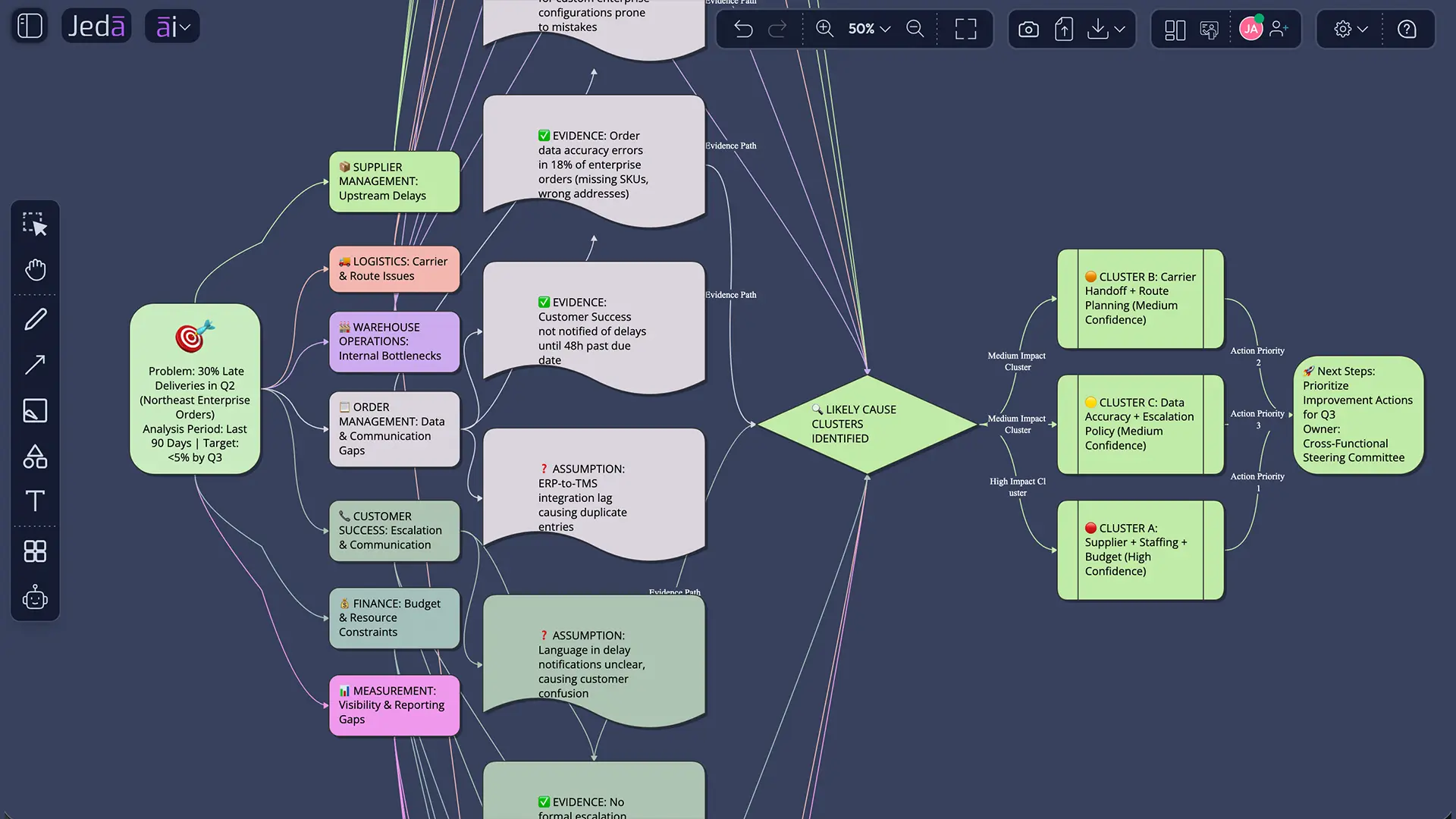
Create an Ishikawa Diagram (Fishbone) for the problem: 30% of customer deliveries were late in Q2. Scope: enterprise orders in the Northeast region. Participation: warehouse operations, logistics, supplier management, customer success, order management, and finance. Implementation timeline: analyze the last 90 days and prepare improvement actions for the next quarter. Improvement areas: supplier lead times, pick-pack workflow, carrier handoffs, order data accuracy, staffing, route planning, escalation policy, and measurement gaps. Additional information: separate evidence-based causes from assumptions, show likely cause clusters clearly, and keep the output editable for a team workshop. Use a horizontal layout and produce the result as a Basic Diagram.
That prompt gives Jeda.ai a clear problem, a time box, a scope, a participant map, and the improvement areas to consider. After generation, the team can edit the fishbone, add data notes, and use AI+ to extend branches that look underdeveloped.
Ishikawa Diagram categories: 6M, 4P, or custom?
There is no sacred category set. Manufacturing teams often use the 6M categories: Manpower, Machine, Method, Material, Measurement, and Mother Nature or Environment. Service teams often use variations such as People, Process, Policies, and Place. Product teams may use User, Product, Data, Process, Technology, and Market.
Choose categories that match the system you are analyzing. The category names should help the team think, not impress a quality auditor. For a software onboarding issue, “Machine” may be useless. “Platform reliability” is better. For a support SLA problem, “Materials” probably says nothing. “Knowledge base quality” might say everything.
| Best For | Typical Categories | Risk | |
|---|---|---|---|
| 6M Fishbone | Manufacturing, operations, quality control | Manpower, Machine, Method, Material, Measurement, Environment | Can feel forced for service or software issues |
| 4P Fishbone | Service processes and public-sector workflows | People, Place, Procedure, Policies | May underrepresent technology or data issues |
| Custom Fishbone | Product, SaaS, consulting, cross-functional RCA | Team-specific branches based on the actual process | Needs discipline so categories do not overlap too much |
How AI changes root-cause analysis
AI does not replace root-cause analysis. It raises the ceiling and lowers the entry cost.
The classic Fishbone Diagram depends on whoever is in the room. That can be powerful. It can also be biased. AI can bring structure to the first draft, suggest overlooked cause families, and help teams create multiple visual versions without rebuilding the diagram from scratch. In Jeda.ai, that matters because the output is editable. You are not trapped inside a generated image.
But the leadership move is this: treat AI-generated fishbones as hypothesis maps. Rank the causes. Test them. Ask which causes have evidence, which ones are assumptions, which are controllable, and which are downstream symptoms. Then move into validation and action planning.
Common mistakes to avoid
The first mistake is writing a vague problem statement. If the head of the fish is foggy, every bone will be foggy too.
The second mistake is treating every cause as equal. A Fishbone Diagram lists possibilities. It does not rank impact. Add a follow-up step for evidence, probability, severity, and controllability.
The third mistake is using generic categories when custom categories would work better. The 6M model is useful, but it is not a law of nature.
The fourth mistake is letting departments defend themselves instead of mapping the system. A good Ishikawa Diagram makes blame less useful and causality more visible.
The fifth mistake is stopping at the diagram. The diagram is not the improvement. It is the doorway.
Frequently Asked Questions
- What is an Ishikawa Diagram with AI?
- An Ishikawa Diagram with AI is a cause-and-effect diagram generated or assisted by AI. It helps teams map possible root causes behind a problem, organize them into categories, and create an editable visual for root-cause analysis.
- Is an Ishikawa Diagram the same as a Fishbone Diagram?
- Yes. Ishikawa Diagram, Fishbone Diagram, cause-and-effect diagram, and herringbone diagram usually refer to the same root-cause analysis tool. The name Fishbone comes from the visual shape, while Ishikawa refers to Kaoru Ishikawa.
- How do I create an Ishikawa Diagram in Jeda.ai?
- The recommended method is to open AI Menu, choose Diagrams, select Quality & Process Improvement, and use the Ishikawa Diagram (Fishbone) recipe. You can also create one from the Prompt Bar by selecting the right visual command and describing the problem.
- Which Jeda.ai method is better: Recipe or Prompt Bar?
- Use the Diagram Recipe for serious root-cause analysis because it captures subject, scope, participation, timeline, improvement areas, and additional context. Use the Prompt Bar for quick drafts, workshop warmups, or fast visual exploration.
- Can AI find the actual root cause?
- AI can suggest possible causes and structure the analysis, but it cannot prove the root cause by itself. Use the AI-generated fishbone as a hypothesis map, then validate causes with data, observation, stakeholder input, and follow-up analysis.
- What are the common categories in a Fishbone Diagram?
- Manufacturing teams often use the 6M categories: Manpower, Machine, Method, Material, Measurement, and Environment. Service teams may use People, Place, Procedure, and Policies. In Jeda.ai, you can customize categories to match the actual process.
- Can I use Web Search with the Ishikawa Diagram Recipe?
- Yes. Jeda.ai includes a Web Search option for AI Recipes. Turn it on when the analysis needs current external context, such as industry benchmarks, regulations, competitor activity, or recent market changes.
- Can I edit the generated Fishbone Diagram?
- Yes. Jeda.ai generates editable Smart Shape visuals for diagrams, mind maps, flowcharts, and related visual outputs. You can change text, move branches, adjust colors, and reorganize the diagram on the AI Whiteboard.
- How should I use AI+ after generating the diagram?
- Use AI+ to extend or deepen an existing branch after the first diagram is generated. It is useful when a cause category needs more detail, but the main instructions should still go into the original recipe or Prompt Bar input.
- What should I do after creating the Ishikawa Diagram?
- After creating the diagram, prioritize likely causes, validate them with evidence, run 5 Whys on the strongest branches, and move into corrective action planning. The diagram starts the investigation; it does not finish it.
Sources and further reading
Create an Ishikawa Diagram with AI in Jeda.ai
Join 150,000+ users using Jeda.ai to turn root-cause analysis, process improvement, and strategic thinking into editable Visual AI workspaces.
Start Your Fishbone Diagram