AI Infographic Generator pages usually promise the same thing: paste a prompt, get a pretty layout, move on. That sounds nice. It also falls apart fast when your team needs accuracy, context, edits, feedback, and a visual that can survive more than one meeting.
That is where Jeda.ai feels different. Instead of acting like a one-shot design toy, it gives you an AI Workspace and AI Whiteboard where you can generate, refine, and reshape infographic content with AI, then keep working on the result with your team. For marketers, consultants, product teams, business analysts, product design engineers, and industrial design engineers, that matters. A lot.
And the timing is good. McKinsey’s 2025 global survey says companies are redesigning workflows and governance to capture value from generative AI rather than treating it like a novelty. In plain English: teams want AI outputs they can actually use in real work, not just admire for ten seconds. Jeda.ai is built for that kind of work. It is already used by 150,000+ users, and it brings together Visual AI, collaboration, editable outputs, and 300+ strategic frameworks inside one canvas.
What is an AI Infographic Generator?
An AI Infographic Generator turns raw text, documents, structured notes, screenshots, or data into a visual summary that people can scan quickly and understand without reading a ten-page memo.
That definition sounds simple. The hard part is not the first draft. The hard part is choosing the right story, the right hierarchy, and the right level of detail.
Research still backs the same old truth. Cleveland and McGill showed that chart choice affects how accurately people read quantitative differences, and Mayer’s multimedia learning work argues that words plus graphics work best when the structure is deliberate rather than noisy. So an infographic is not “text with icons.” It is visual argument design. If the structure is weak, the output looks busy and says very little.
In Jeda.ai, the Infographic command gives you a strong starting point: a title plus structured short sections that you can edit. But the real advantage comes from the wider AI Workspace. You can build the narrative with the Prompt Bar, use AI Recipes, bring in supporting context through uploaded files or selected canvas content, then keep refining on the AI Whiteboard instead of restarting from zero every time.
Why teams use an AI Workspace for infographic work now
Most teams do not struggle because they cannot draw a box. They struggle because the source material is messy.
One stakeholder sends a PDF. Another dumps CSV rows into chat. Someone else pastes meeting notes. Then the designer gets the classic masterpiece of modern management: “Can you turn this into something clean by today?”
That is why infographic work has moved beyond template picking. It now lives inside broader AI-assisted workflows where analysis, summarization, and visual storytelling happen together. Top tool pages in this category lean hard on fast generation, templates, and drag-and-drop editing. Useful, yes. But usually narrow. Jeda.ai adds a stronger layer: it lets you work from prompt, recipe, document, data, and existing visual context inside one shared canvas instead of bouncing between separate apps.
- Prompt-to-visual speed
Start with a topic, prompt, or outline and generate an infographic draft fast enough to keep momentum.
- Evidence-in workflow
Bring in documents, screenshots, and structured thinking before you design the final visual story.
- Editable output
Unlike a static image workflow, your infographic lives on the canvas where text, layout, and visuals can keep improving.
- Collaboration on the board
Review, refine, and present in the same AI Whiteboard instead of turning edits into a version-control horror show.
- AI+ expansion
Use AI+ to deepen supporting sections and generate more detail from selected visual structures without rebuilding everything.
- Grounded storytelling
Use web-assisted research, uploaded context, and related visual analysis to make the infographic sharper and more credible.
| Fast draft | Editable canvas | Document/data context | AI extension path | Built for teams | |
|---|---|---|---|---|---|
| Jeda.ai | ✓ | ✓ | ✓ | ✓ | ✓ |
| Template-led infographic tool | ✓ | Usually limited to design layer | Often partial | Usually prompt again | Varies |
| Static image workflow | Sometimes | ✗ | ✗ | ✗ | ✗ |
How to create an infographic in Jeda.ai
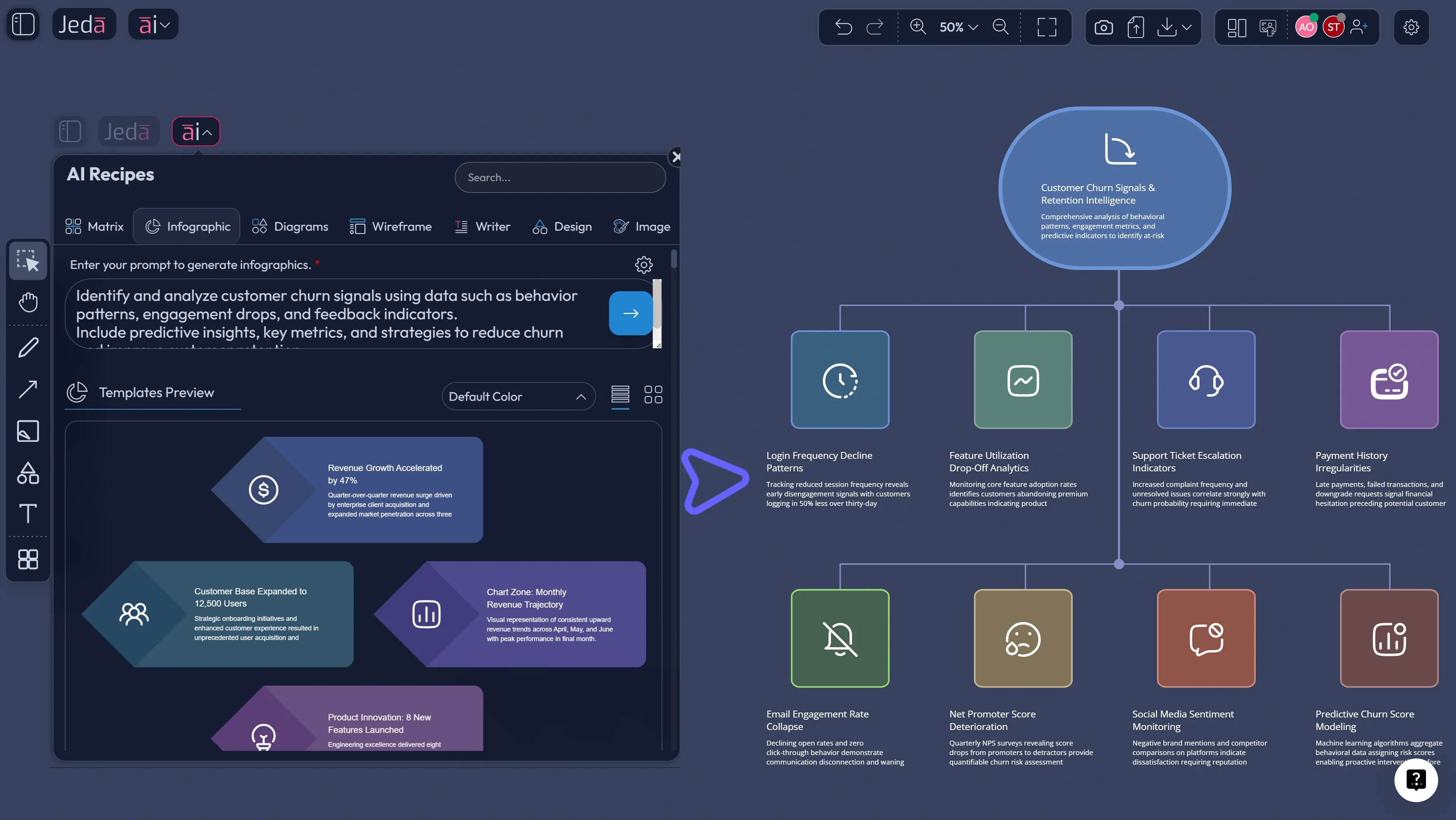
You have three strong routes here: the AI Menu recipe path, the Prompt Bar path, and an AI Vision path where you start from existing context such as a screenshot, document, or selected canvas content. For most people, the recipe path is the smoothest first move.
Method 1: AI Menu Recipe Matrix
This is the best starting point when you want structure, speed, and fewer blank-page decisions.
- Open the AI Menu
Click the AI Menu in the top-left corner of the Jeda.ai workspace and choose the Infographic recipe category.
- Select an infographic recipe or template
Choose a layout style that matches your story: summary, comparison, step-based flow, data snapshot, or executive brief.
- Fill in the guided fields
Add your topic, target audience, objective, key points, tone, and any must-include numbers or claims.
- Generate the infographic draft
Let Jeda.ai produce the first version as an editable visual inside the AI Workspace.
- Refine on the canvas
Edit copy, move blocks, tighten headings, and adjust visual emphasis so the infographic reads clearly at a glance.
- Extend with AI and convert supporting visuals
Use AI+ to deepen related visual sections where needed, then use Vision Transform or other commands to convert supporting analysis into infographic-ready content.
Method 2: Prompt Bar
The Prompt Bar is the faster route when you already know the story you want. Open the prompt area at the bottom of the canvas, select the Infographic command, describe the topic, the audience, the tone, the sections, and the visual style, then generate.
A strong prompt usually includes five things:
- the audience,
- the goal,
- the section structure,
- any mandatory numbers or claims,
- the visual mood.
Here is a solid example:
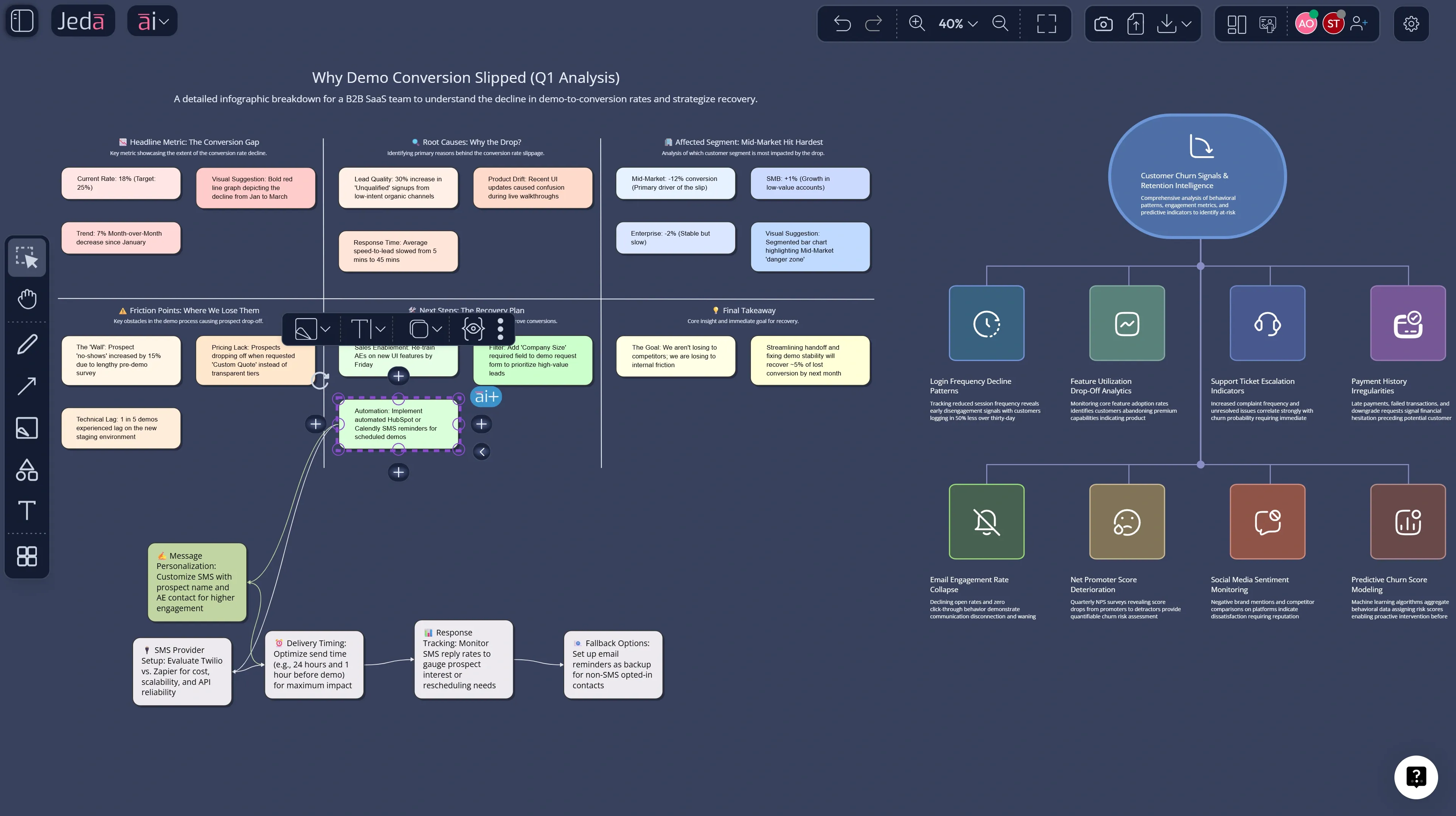
Create an executive infographic for a SaaS leadership team. Title: “Why Activation Dropped in Q1.” Include six short sections: top-line change, three root causes, customer segments affected, product friction points, recommended next steps, and one closing summary. Keep the tone sharp, businesslike, and easy to scan.
That works because it gives the model a job instead of a vibe.
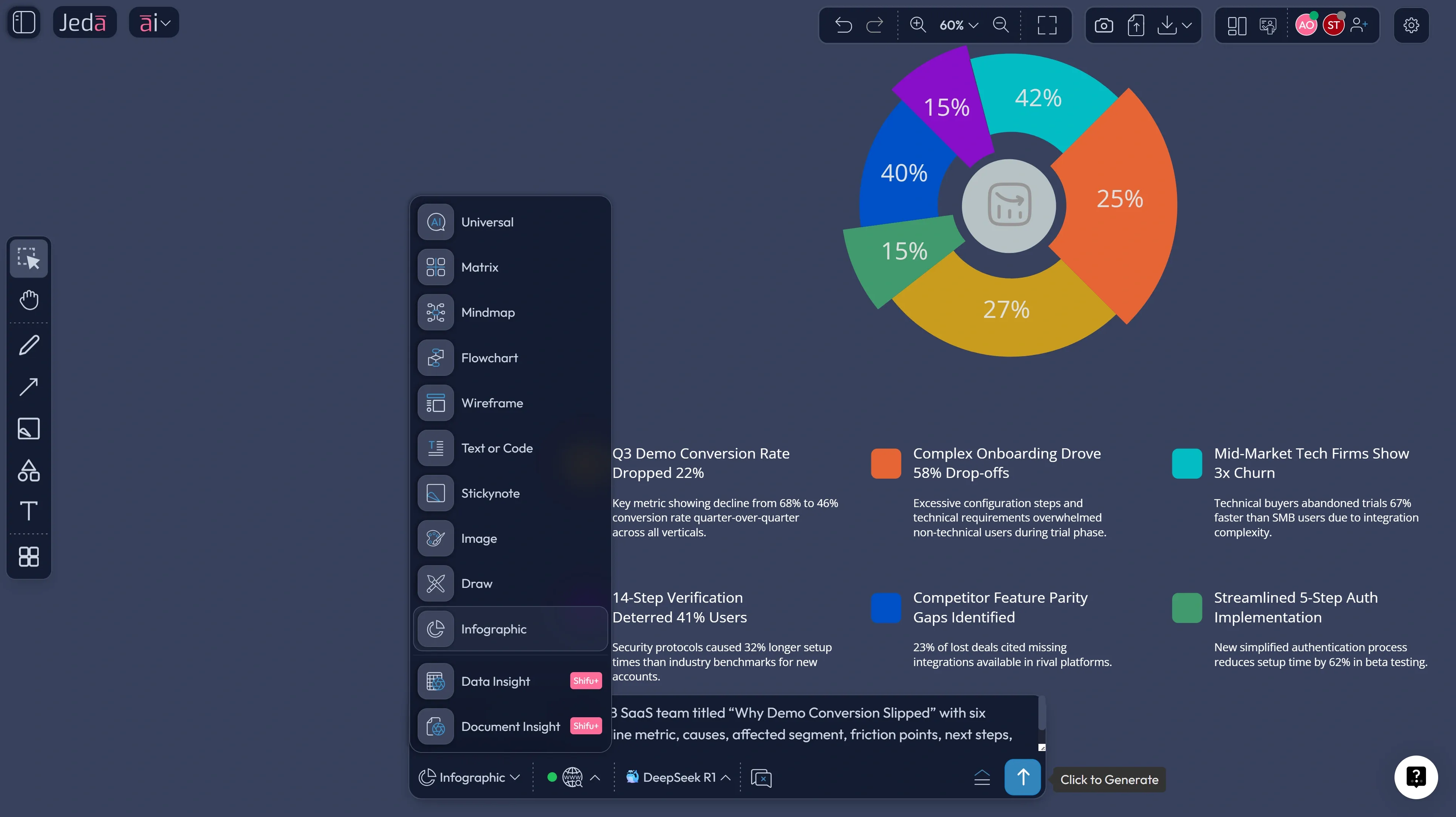
Method 3: AI Vision, uploaded context, and transformation
This is the sleeper feature. It is also where many infographic pages from other tools stay weak.
Sometimes you do not want to start from a blank prompt. You want to start from what already exists: a screenshot, a PDF, a spreadsheet summary, a slide, a rough board, or a selected cluster on the canvas. Jeda.ai supports that style of work through uploaded context, Data Insight, Document Insight, and Vision Transform. You can upload a file, choose a path that extracts the useful structure, and turn that into an infographic-ready visual.
So if you already have a messy board full of notes, or a document full of findings, you do not need to manually rewrite everything into infographic language first. Pull in the context. Extract the signal. Then turn it into a visual story.
What makes an infographic actually work
Pretty is not the goal. Comprehension is.
Nielsen Norman Group describes infographics as a way to make complex information easier to understand, but only when visuals and text strengthen each other. That is the part teams skip when they rush. They generate panels, sprinkle icons, and hope the audience feels informed. The audience does not. It feels managed.
Here is the better standard:
1. One story, not five
Pick the question the infographic answers. Not the topic. The question. “What happened?” “Why did it happen?” “What should we do next?” That keeps the visual honest.
2. Short sections with visual hierarchy
The Jeda.ai Infographic format is helpful here because it naturally favors one title and several short supporting items. That pushes you toward concise explanation instead of text soup.
3. Numbers that earn their place
IBM defines data visualization broadly as using graphics such as charts, plots, and infographics to communicate relationships and insights clearly. Fine. But not every number deserves a chart. Some numbers deserve one sentence and a bold highlight. Some deserve no airtime at all.
4. Chart choice that respects human perception
Cleveland and McGill’s work still matters because people read some encodings more accurately than others. If your infographic compares magnitude, use visual forms that help people compare magnitude. Do not get cute when clarity is on the line.
5. Context before decoration
A viewer should understand what the data means, why it matters, and what action follows. Icons and gradients do not fix missing context. They just make the omission shinier.
6. Space to refine
This is where Jeda.ai wins. Because the infographic sits inside an AI Workspace, you can keep adjusting story order, block emphasis, and supporting visuals instead of exporting too early and regretting everything later.
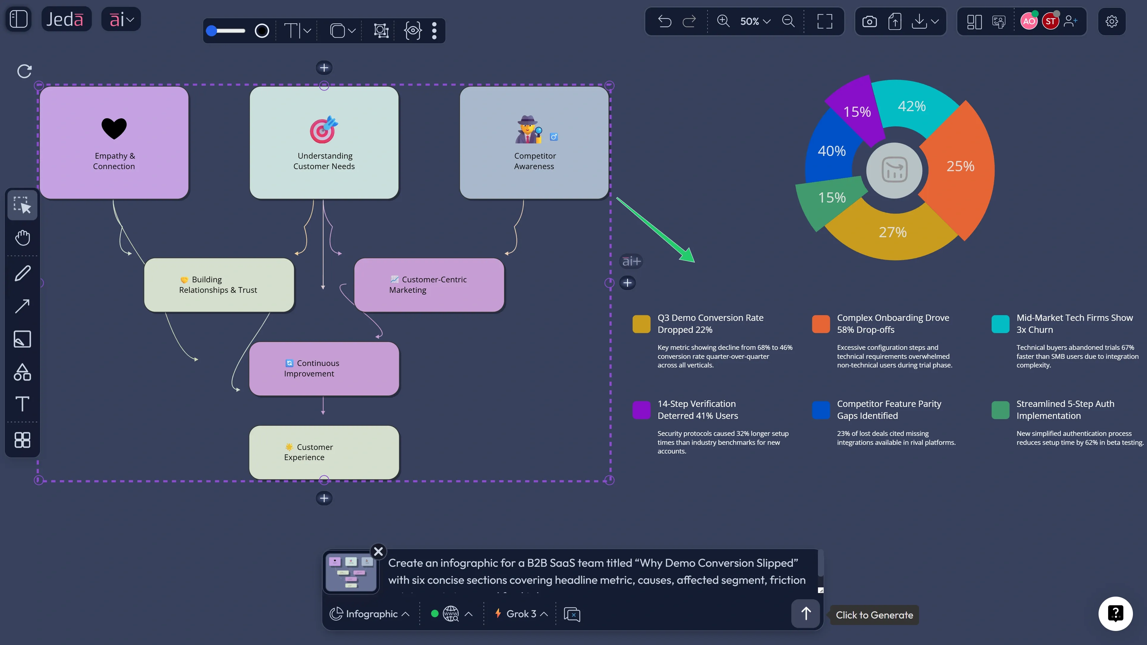
How AI+ gives you the deep-dive path
The user note for this page is right: AI+ should not be treated like a gimmick. It is the deep-dive path.
Here is the smart way to use it. Do not ask one infographic to carry all the analysis. Use the infographic as the front door. Then build deeper supporting visuals behind it.
For example:
- create the executive infographic first,
- generate a supporting matrix for risks or trade-offs,
- expand a key branch or section with AI+,
- convert or summarize the expanded insight back into the infographic or a companion visual.
That way, the main infographic stays crisp while the board still holds the detail. Your summary stays readable, and your reasoning stays available.
In practice, this works especially well for:
- board summaries,
- marketing performance recaps,
- product launch explainers,
- research synthesis,
- customer insight snapshots,
- investor-ready visual summaries.
AI Infographic Generator examples worth building
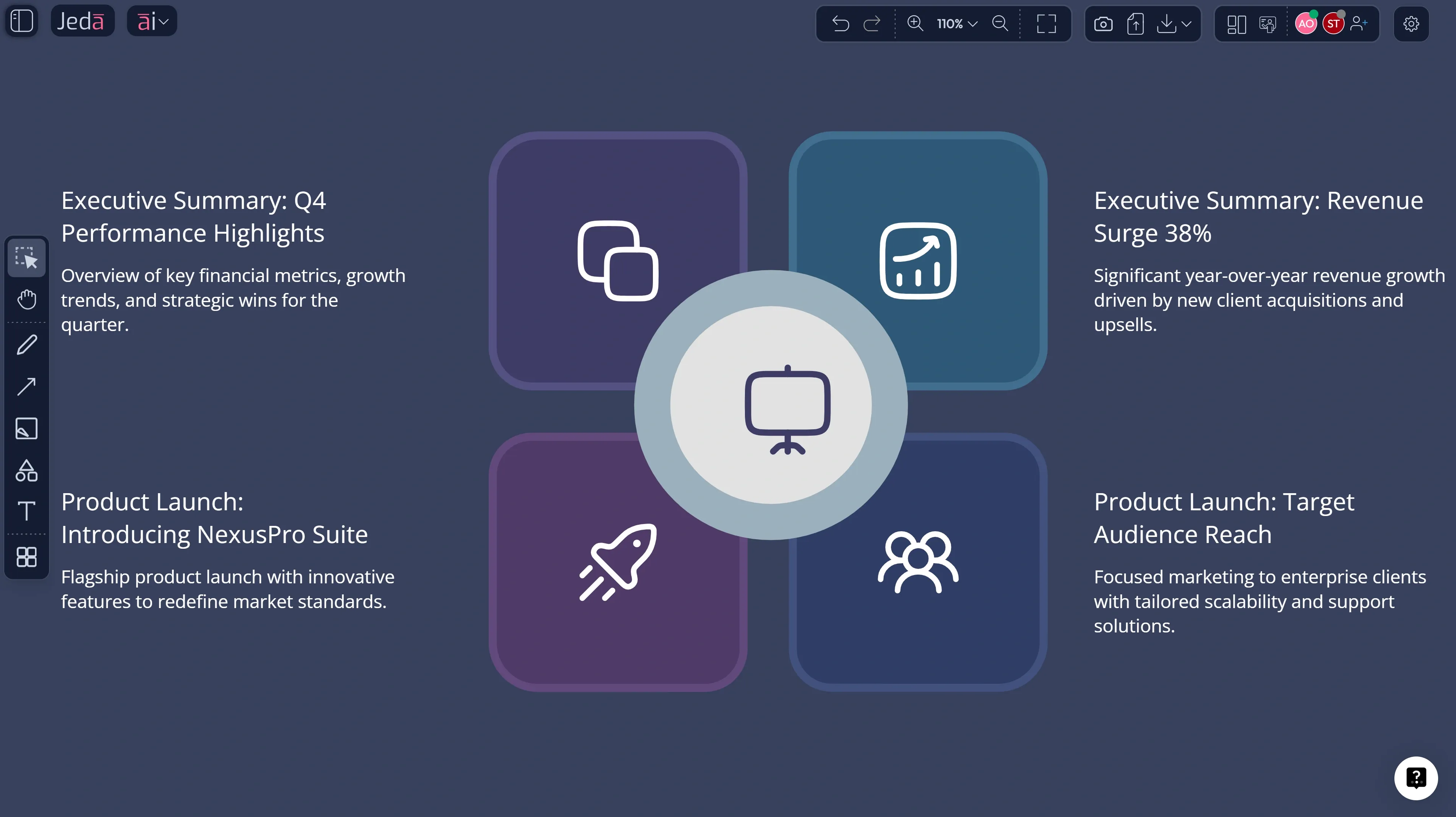
Executive summary infographic
Great for leadership teams that want the headline, the cause, and the next move without wading through a dense deck.
Product launch one-pager
Useful when marketing, product, and sales all need the same story told with the same structure. Miracles do happen.
Market research snapshot
Take uploaded findings, summarize the strongest patterns, and turn them into a visual that works in workshops, presentations, or async updates.
Data-to-story recap
Use Data Insight to surface the important patterns, then transform those patterns into a cleaner narrative infographic for non-technical stakeholders.
Workshop recap board
After a brainstorming or strategy session in the AI Whiteboard, summarize the decisions, themes, and next steps into a single infographic that people might actually read.
Common mistakes to avoid
Frequently Asked Questions
- What is an AI infographic generator?
- An AI infographic generator turns text, data, or other source material into a structured visual summary. The good ones do more than decorate information. They help organize the story, simplify the hierarchy, and give you a draft you can refine into something people will actually understand.
- How is Jeda.ai different from a basic infographic maker?
- Jeda.ai gives you more than a template editor. It combines an editable AI Workspace, AI Whiteboard collaboration, AI Recipes, Prompt Bar generation, uploaded-context workflows, and supporting visual commands so the infographic can be part of a larger thinking and decision process.
- Can I create an infographic from a document in Jeda.ai?
- Yes. Jeda.ai supports document-based workflows through Document Insight and uploaded context. You can extract structure from source material, turn it into a visual summary, and then convert or refine that output into an infographic for presentation or recap.
- Can I use data to build an infographic in Jeda.ai?
- Yes. Data Insight lets you analyze CSV or Excel content and produce structured visual outputs. From there, you can convert the strongest findings into an infographic that is easier for non-technical stakeholders to scan and discuss.
- Is the infographic editable after generation?
- Yes. The Infographic command in Jeda.ai creates an editable result on the canvas, which matters because the first draft is rarely the final draft. You can refine text, structure, placement, and supporting content inside the workspace instead of restarting.
- What is the fastest way to get a good result?
- For most users, the fastest route is the AI Menu recipe path because it gives you structure from the start. If you already know the audience, sections, and tone, the Prompt Bar is quicker. If you already have source material, start with uploaded context or Vision Transform.
- How should I write prompts for infographic generation?
- Keep prompts specific. Name the audience, the purpose, the number of sections, the must-include facts, and the tone. Vague prompts create vague panels. Structured prompts create structured visuals, which means you spend more time refining quality and less time fixing chaos.
- Where does AI+ fit into infographic work?
- AI+ is best used as a deep-dive path. Expand a selected supporting visual, such as a matrix, diagram, or flowchart, to explore more detail. Then pull the strongest conclusions back into the infographic so the main visual stays sharp while the board keeps the full reasoning trail.
- Can teams collaborate on an infographic inside Jeda.ai?
- Yes. That is one of the stronger reasons to use Jeda.ai in the first place. The infographic lives on the board, so teams can review, edit, present, and iterate inside the same collaborative workspace instead of sending static exports back and forth.
- Can I try the AI Infographic Generator for free?
- Yes. Jeda.ai offers a Whitebelt free plan, with Blackbelt and Shifu plans for broader usage and advanced capabilities. That gives teams a low-friction way to test infographic workflows before they decide whether they need the more advanced AI and collaboration paths.
Sources & Further Reading
- [1]
Cleveland, William S.; McGill, Robert (1984) . “Graphical Perception: Theory, Experimentation, and Application to the Development of Graphical Methods” Journal of the American Statistical Association.
View Source ↗ - [2]
Mayer, Richard E. (2021) . “Multimedia Learning” Cambridge University Press.
View Source ↗ - [3]
Cromley, Jennifer G.; Chen, Runzhi (2025) . “A meta-analysis of Richard Mayer's multimedia learning research: Searching for boundary conditions of design principles across multiple media types” Educational Research Review.
View Source ↗ - [4]
Kane, Lexie (2018) . “Designing Effective Infographics” Nielsen Norman Group.
View Source ↗ - [5]
IBM (n.d.) . “What Is Data Visualization?” IBM.
View Source ↗ - [6]
Singla, Alex et al. (2025) . “The state of AI: How organizations are rewiring to capture value” McKinsey.
View Source ↗
Start Building with the AI Infographic Generator
Join over 150,000 professionals using Jeda.ai to turn scattered context into clear visuals inside an editable AI Workspace.
Try Free Template