Visual Data Analysis with AI is what you do when you’re done staring at spreadsheets like they owe you money. You upload your CSV/Excel, generate charts and insights, then shape those insights into decision-ready visuals—matrices, diagrams, flowcharts, or infographics—inside a single AI Workspace.
Jeda.ai is built for this loop: analyze → visualize → decide → extend. It’s a Visual AI workspace and AI Whiteboard used by 150,000+ users, with 300+ strategic frameworks available through the AI Menu for turning analysis into action.
What is Visual Data Analysis with AI?
Visual data analysis is the practice of using visuals (charts, structured layouts, and interactive views) to spot patterns, compare groups, and find outliers faster than raw tables allow. When you add AI, you also get help summarizing what matters, generating structured explanations, and turning insights into next-step plans.
Visual analytics research often defines the goal as analytical reasoning supported by interactive visual interfaces—a human+machine loop where visuals help you think, and computation helps you scale.
Why teams are replacing “dashboard-only” thinking
Dashboards can show numbers. They don’t always explain why the numbers moved, what trade-offs exist, or what to do next.
Here’s the difference:
- Dashboards: track metrics
- Visual analytics: explain causes, compare options, and produce decisions
- AI-powered visual analytics: does both, faster—because AI can draft hypotheses, summarize anomalies, and propose next steps you can validate
This matches a classic visualization interaction pattern: start with an overview, zoom/filter, then drill into details. That “overview → zoom/filter → details on demand” flow shows up repeatedly in visualization research and practice.
What you can do in Jeda.ai for visual data analysis
Jeda.ai gives you two big advantages:
- Data Insight for fast analysis from CSV/Excel
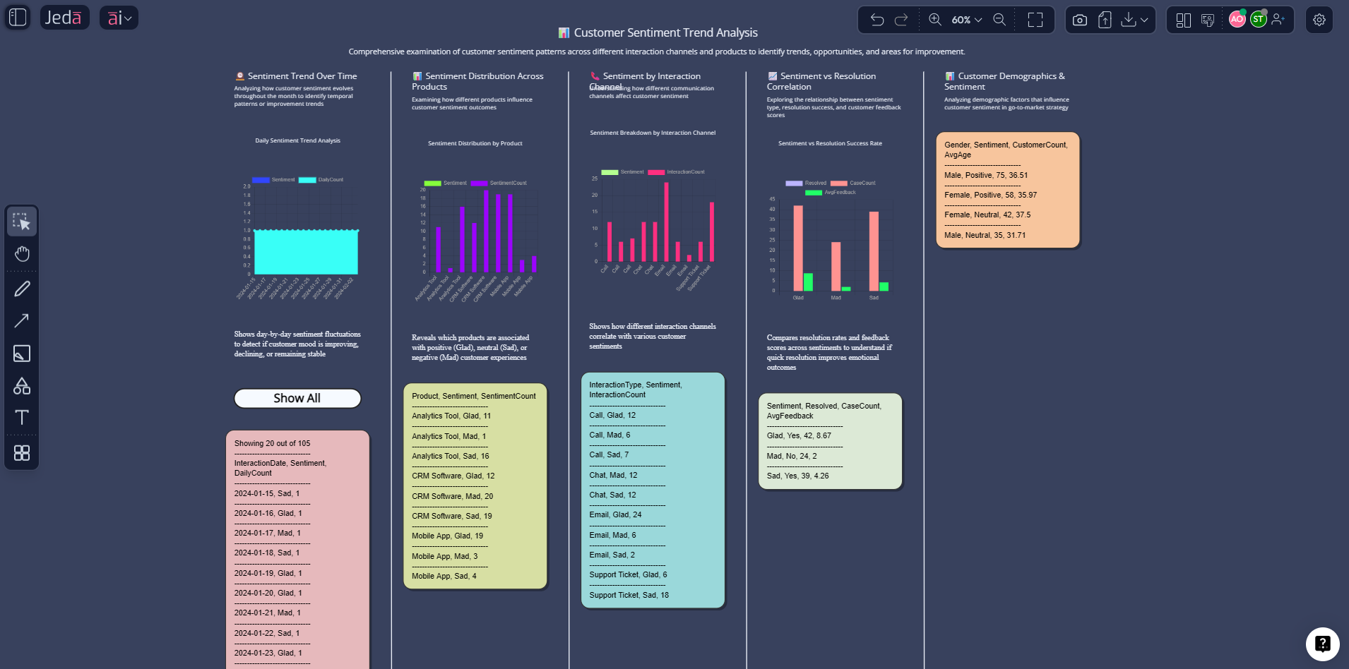
- Visual formats (Matrix, Diagram, Flowchart, Mindmap, Infographic) to convert insights into decision artifacts you can share
The “Data Insight” core loop (CSV/Excel)
- Upload a CSV/Excel file
- Select Data Insight
- Generate charts + insights
- Choose the output type you need (matrix, flowchart, infographic, etc.)
Your outputs stay editable
Most visuals in Jeda.ai are editable smart shapes—colors, text, layout, and structure—so you can clean up the story before you export. (Art outputs are static images, but Data Insight visuals are editable.)
Export that fits real workflows
Export is PNG, SVG, PDF only—clean, dependable, and slide-friendly without pretending it’s a PowerPoint plugin.
How to do Visual Data Analysis with AI in Jeda.ai
This section is the “do it now” playbook. You’ll use:
- Method 1: Recipe Matrix (best when you want a proven framework)
- Method 2: Prompt Bar (best when you want flexible, fast iteration)
- Then: AI+ deep dive to extend insights into actions
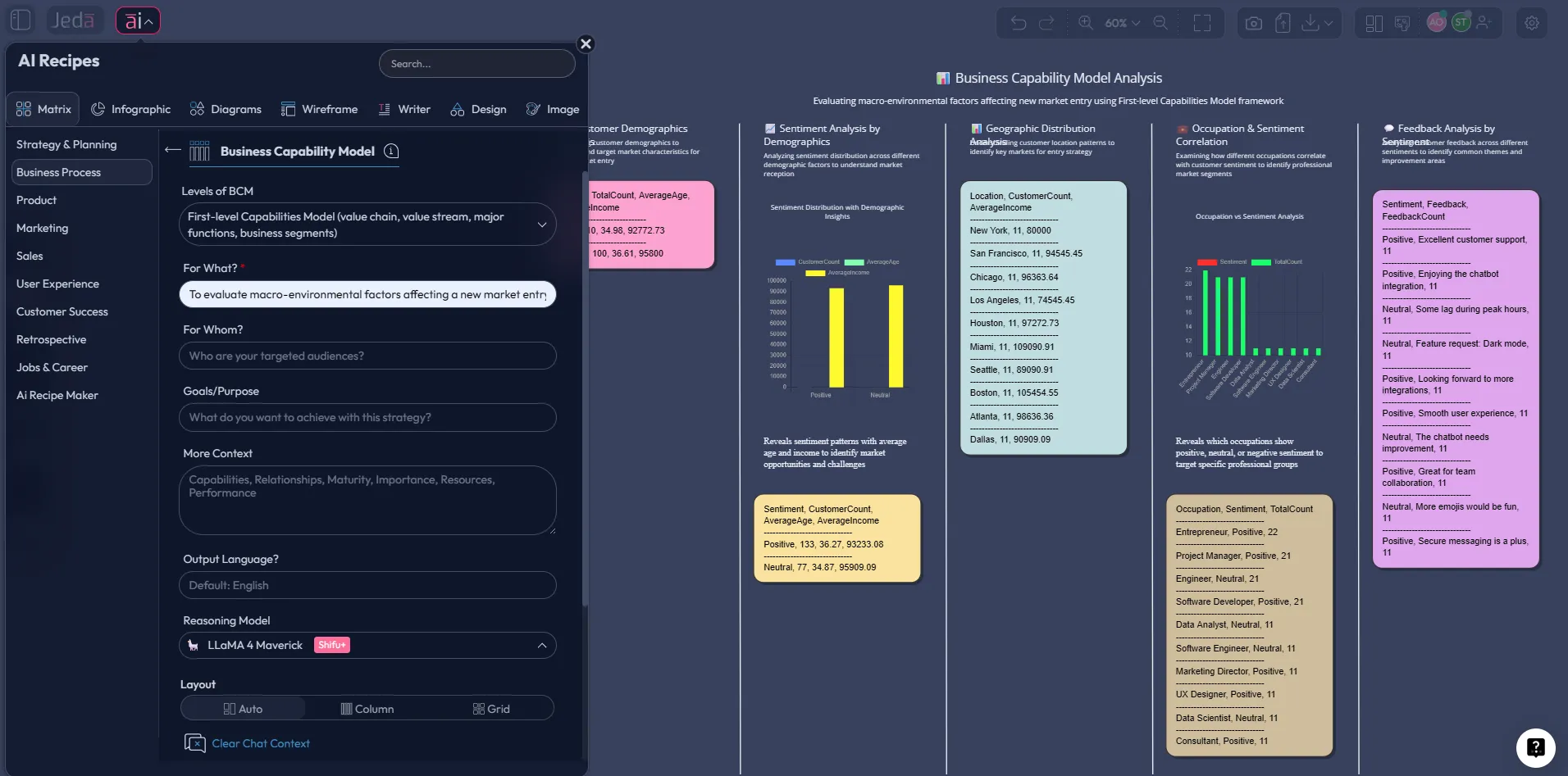
Method 1: Recipe Matrix (turn data into a decision framework)
Use this when you don’t just want charts—you want a structured business decision output (like SWOT, risk analysis, prioritization, or a plan). Jeda.ai’s AI Menu includes 300+ strategic frameworks you can use to wrap your data insights in a decision structure.
Workflow
- Run Data Insight on your CSV/Excel to extract key patterns
- Open the AI Menu and pick a Matrix Recipe that matches your decision
- Paste the key findings into the recipe fields (or summarize them as bullets first)
- Generate the framework on the canvas
- Refine manually (edit cells, adjust labels, add icons)
When this method wins
- You need a repeatable structure for stakeholders
- You want the analysis to end with a clear decision format
- You’re building a deliverable (consulting, PM review, exec update)
Method 2: Prompt Bar (fast, flexible visual analysis)
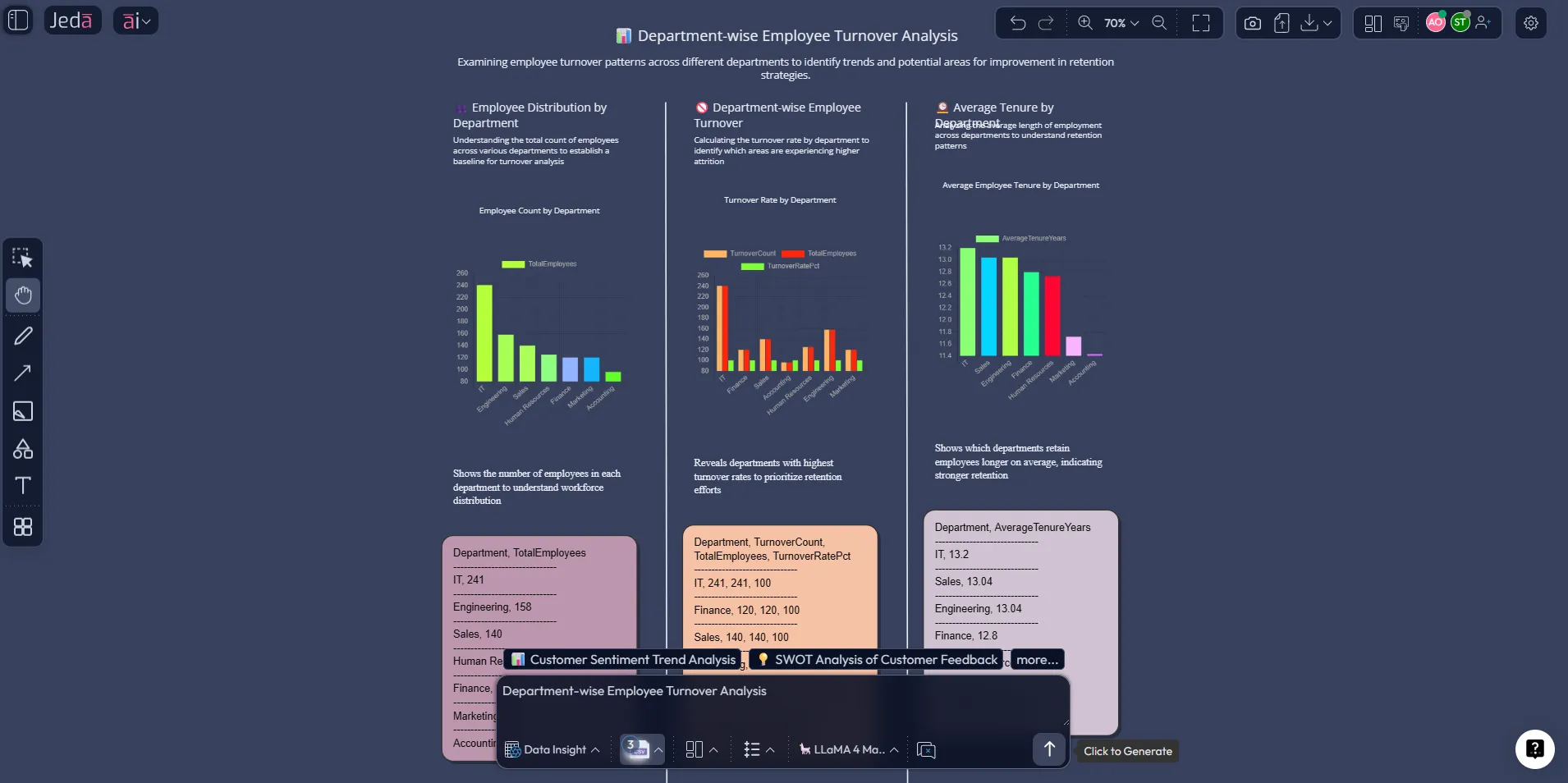
Use this when you want speed and iteration. The Prompt Bar is the fastest way to run Data Insight, switch output formats, and refine prompts without leaving the canvas.
What to generate first (the “baseline board”)
Start with a board that includes:
- 2–4 charts that answer your main question
- A short “top insights” block
- 3–5 recommended actions
- Upload your dataset
Upload a CSV or Excel file from the top toolbar so Jeda.ai can analyze it using Data Insight.
- Select Data Insight and define the goal
Choose the Data Insight command, then write one sentence describing what decision you’re trying to make.
- Generate charts + insights
Generate the first pass. Keep it broad: trends, segments, anomalies, and drivers.
- Switch the output type for the next view
Use Data Insight sub-commands to render the same findings as a Matrix, Flowchart, Diagram, Mindmap, Stickynotes, Text, Wireframe, or Infographic.
- Refine and export
Edit text, colors, and layout. Export the visible area as PNG/SVG/PDF when it’s presentation-ready.
Prompt patterns that work (copy/paste)
Use prompts that force clarity:
Trend + drivers
- Generate a visual data analysis from this dataset. Show revenue and orders trend by month, highlight the top 3 inflection points, and list the likely drivers.
Segment comparison
- Generate a segmented analysis by plan_code. Show churn rate, ARPA, and retention by plan, then summarize what’s working and what’s failing.
Anomaly scan
- Generate charts that surface anomalies and outliers. Explain the top 5 anomalies and propose 3 checks to validate whether they are data issues or real behavior.
AI+ deep dive (extend any insight into actions)
This is where the “visual” part becomes a real advantage.
After you generate the first visual:
- Click a smart shape (an insight box, a chart label, a matrix cell, a flowchart step)
- Tap the AI+ button
- Ask for an extension: root causes, next steps, alternatives, risks, or an execution plan
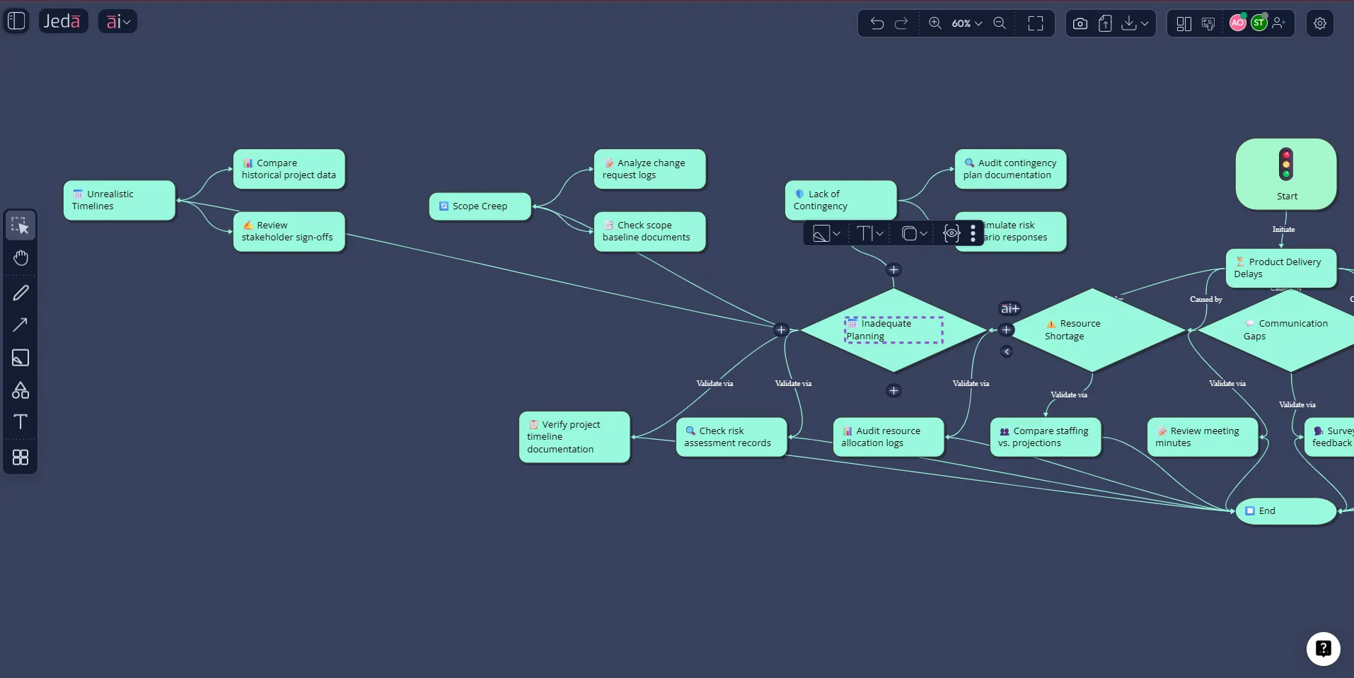
AI+ prompts that produce useful extensions
- Extend this insight into a root cause diagram with 5–7 causes and 2 validation checks per cause.
- Extend this recommendation into a 30-day execution plan with owners, milestones, and risks.
- Extend this anomaly into 3 competing hypotheses and the data you’d need to confirm each one.
Convert insights into the right visual (without rework)
Visual data analysis is not “one chart to rule them all.” Different decisions need different formats:
- Matrix: trade-offs, prioritization, structured assessment
- Flowchart: operational process, funnel logic, what-to-do-next
- Diagram: systems view, drivers and relationships
- Mindmap: exploration, hypothesis expansion
- Infographic: executive summary you can paste into a report
Jeda.ai supports converting and re-rendering outputs across these formats on the same AI Workspace.
Best practices that keep you from lying with charts
AI can speed you up. It can also help you publish nonsense faster—so here are guardrails.
1) Use encodings humans read accurately
Research on graphical perception shows some visual judgments are more accurate than others (position and length tend to beat area and angle). Keep this in mind when choosing charts.
2) Start with EDA before you “tell the story”
Exploratory Data Analysis (EDA) is about discovering structure and surprises before you lock a narrative. That mindset matters even more when AI is drafting insights quickly.
3) Don’t skip the “why” step
If the output stops at “what happened,” use AI+ or a Diagram/Flowchart view to map drivers, decisions, and next steps.
Use cases: how different teams use visual data analysis
Strategy consultants
- Turn client data into a decision matrix + one-page infographic summary
- Use AI+ to extend risks, assumptions, and next steps
- Export as PNG/SVG/PDF for deliverables
Product managers
- Analyze funnels, feature adoption, cohort retention
- Convert insights into a flowchart of “what we change next”
- Collaborate live on an AI Whiteboard
Marketing teams
- Compare channel performance and CAC vs ROI
- Generate an action plan per channel using AI+
- Keep the whole narrative in one AI Workspace
Business analysts
- Run Data Insight, validate anomalies, and document assumptions
- Convert findings into a matrix of recommendations and constraints
- Keep a clean audit trail on the canvas
Honest comparison: where Jeda.ai fits
| Approach | Strength | Weakness | Best for | |
|---|---|---|---|---|
| Jeda.ai (AI Workspace + visual outputs) | Jeda.ai (AI Workspace + visual outputs) | Charts + structured decisions on one canvas | Not a classic BI warehouse dashboard | Decision artifacts, workshops, fast analysis-to-action |
| Spreadsheet-only | Spreadsheet-only | Flexible and familiar | Slow to explain and share the story | Quick checks, simple models |
| BI dashboard-only | BI dashboard-only | Strong monitoring and recurring reporting | Harder to turn into a decision narrative | Ops reporting, metric tracking |
| Chat-only AI | Chat-only AI | Fast summaries | No persistent visual structure or board-level editing | Drafting notes, quick explanations |
FAQ: Visual Data Analysis with AI
- What is Visual Data Analysis with AI?
- Visual Data Analysis with AI is the process of turning data into charts and structured visuals, then using AI to summarize insights and propose actions, so you can decide faster and communicate clearly.
- Can Jeda.ai analyze CSV and Excel files?
- Yes. Upload a CSV or Excel file and use the Data Insight command to generate charts, summaries, and analysis that you can convert into matrices, diagrams, flowcharts, or infographics.
- Is Data Insight available on every plan?
- Data Insight is available on paid tiers and is designed for analyzing datasets with charts and strategic insights. Whitebelt supports all commands with limited daily usage, while Blackbelt and Shifu expand capabilities and limits.
- How do I turn analysis into an action plan?
- Select a key insight on the canvas and use the AI+ button to extend it into root causes, next steps, risks, and a structured execution plan.
- What’s the fastest way to get a decision-ready output?
- Run Data Insight first, then use a Matrix Recipe from the AI Menu to frame the findings into a proven decision format like SWOT, risk analysis, or prioritization.
- Can I convert one visual into another format?
- Yes. Jeda.ai supports converting visuals across formats, so you can move from charts to a matrix, flowchart, or infographic without rebuilding the content from scratch.
- Does Jeda.ai export to PowerPoint?
- No. Export is PNG, SVG, and PDF only.
- Is everything editable after generation?
- Yes for smart-shape visuals like matrices, diagrams, and Data Insight outputs. Art outputs are static images and are not editable.
- How does web search work in Jeda.ai?
- Web search is a platform feature that you can toggle in the Prompt Bar. It helps ground outputs with up-to-date information when your prompt needs it.
Citations
- [1]
J. J. Thomas & K. A. Cook (eds.) (2005) . “Illuminating the Path: The Research and Development Agenda for Visual Analytics” National Visualization and Analytics Center.
View Source ↗ - [2]
D. Keim, G. Andrienko, J.-D. Fekete, C. Görg, J. Kohlhammer, G. Melançon (2008) . “Visual Analytics: Definition, Process, and Challenges” Lecture Notes in Computer Science (Springer).
View Source ↗ - [3]
B. Shneiderman (1996) . “The Eyes Have It: A Task by Data Type Taxonomy for Information Visualizations” IEEE Symposium on Visual Languages.
View Source ↗ - [4]
W. S. Cleveland & R. McGill (1984) . “Graphical Perception: Theory, Experimentation, and Application to the Development of Graphical Methods” Journal of the American Statistical Association.
View Source ↗ - [5]
J. W. Tukey (1977) . “Exploratory Data Analysis” Addison-Wesley.
View Source ↗
Ready to run your next dataset on a Visual AI workspace?
If you want visual data analysis that ends with decisions—not just charts—build your next board in Jeda.ai. Join 150,000+ users using an AI Workspace and AI Whiteboard to move from raw numbers to shareable, exportable outcomes.
Turn your CSV into a decision board
Run Data Insight, convert to Matrix/Flowchart/Infographic, then extend with AI+.
Try Jeda.ai on an AI Workspace