Stop analyzing spreadsheets the way you did in 2015. Upload your CSV or Excel file to Jeda.ai's AI Workspace and get instant strategic insights—SWOT analysis, competitive positioning matrices, sales trend breakdowns—in 60 seconds flat. No SQL queries. No waiting for analysts. No manual template filling. This guide walks you through Data Insight, Jeda.ai's Shifu+ feature for turning raw data into visual frameworks that actually inform decisions.
What is Data Insight?
Data Insight is Jeda.ai's feature for analyzing CSV and Excel files with AI. Upload your spreadsheet, describe what you want to understand, and Data Insight generates a visual framework—matrix, flowchart, mindmap, diagram, stickynotes, text summary, wireframe, or infographic—complete with strategic analysis and recommendations. It's the bridge between "here are your metrics" and "here's what you should do about it."
The process sounds simple because it is. Unlike traditional BI tools (Tableau, Power BI, Looker) that require data warehouse setup, SQL knowledge, and hours of dashboard configuration, Data Insight works in your AI Workspace. It automates the analytical thinking—extracting patterns, identifying gaps, surfacing opportunities—so your team can focus on execution instead of spreadsheet wrestling.
Data Insight was inspired by the original strategic frameworks. Albert Humphrey's SWOT analysis (1960s) and Michael Porter's competitive positioning frameworks (1979) were designed to crystallize complex business data into actionable insights. The difference: instead of a consultant spending a week manually mapping your data into a matrix, Data Insight does it in seconds.
Why Use Data Insight with AI?
- 60-Second Analysis
Upload data, describe what you need, and get a visual framework instantly. What took 4 hours of manual work now takes 1 minute.
- Strategic Insights, Not Just Metrics
Data Insight doesn't just chart your numbers—it extracts meaning. It generates SWOT analyses, competitive matrices, and actionable recommendations.
- 8 Visual Output Formats
Choose how to visualize: Matrix for frameworks, Flowchart for processes, Mindmap for hierarchies, Infographic for summaries, and more.
- No Coding Required
Non-technical business users can analyze complex datasets without SQL, Python, or BI tool training. Just upload and describe.
- AI-Grounded Analysis
Data Insight reads YOUR data. It doesn't hallucinate generic insights—every recommendation is rooted in your actual numbers.
- Export and Share Instantly
Export your analysis as PNG, SVG, or PDF. Share polished visuals with your team, board, or clients in one click.
Here's the speed comparison: Traditional analysis takes 4+ hours (collect data, organize, create template, fill manually, format, review). Data Insight takes 60 seconds (upload file, describe, generate). A McKinsey study found that AI-assisted data analysis reduces insight-generation time by 65%. Jeda.ai's Data Insight delivers exactly that.
But speed isn't the only win. The real advantage is strategic depth. You're not looking at a bar chart of Q3 revenue. You're looking at a SWOT matrix that identifies your strengths (high deal velocity, new market success), weaknesses (churn in existing segments), opportunities (untapped customer verticals), and threats (competitive pressure). That shift from reporting to strategic clarity is what Data Insight delivers.
How to Analyze Data in Jeda.ai
Ready to try it? Here are two ways to get started—Prompt Bar (fastest) and AI Menu (best for structured workflows).
Method 1: Prompt Bar (Fastest)
The Prompt Bar is your quick entry point. It's the input field at the bottom center of your AI Workspace.
- Click the file upload icon (📎) next to the command selector
- Select your CSV or Excel file from your computer (drag-and-drop works too)
- Jeda.ai auto-selects the Data Insight command
- Type your analysis request: "Create a SWOT analysis from our sales data," or "Generate a competitive positioning matrix from this market research"
- Choose your output format from the dropdown (Matrix, Flowchart, Mindmap, Diagram, Stickynotes, Text, Wireframe, or Infographic)
- Press Enter or click the Generate button
- In ~60 seconds, your analysis appears on the canvas
Method 2: AI Menu (Recommended for Teams)
For structured workflows, the AI Menu offers pre-built templates. Click the AI Menu button (top-left of your AI Workspace), browse to "Data Analysis" recipes, select a template (SWOT, Competitive Matrix, Sales Analysis), and follow the guided form. This method gives you more control over filtering, formatting, and output options.
- Prepare Your Spreadsheet
Ensure your CSV or Excel file has headers and clean data. Remove empty rows and use consistent column names — AI understands context better with tidy data.
- Open Jeda.ai & Create a Workspace
Go to go.jeda.ai, sign in, and click New Workspace to start a blank canvas. You can also use an existing workspace.
- Upload Your File
In the Prompt Bar, click the file icon (📎) next to the command selector. Select your file. Jeda.ai auto-detects Data Insight and switches the command to it.
- Describe Your Analysis
Type what you want to understand. Be specific: 'Analyze Q3 sales by region and identify underperforming areas,' not just 'analyze sales.' Include business context if helpful.
- Choose Your Output Format
Select from 8 options: Matrix (frameworks), Flowchart (processes), Mindmap (hierarchies), Diagram (relationships), Stickynotes (key takeaways), Text (summaries), Wireframe (layouts), or Infographic (visual summaries).
- Generate & Review
Press Enter or click Generate. AI analyzes your data and creates the visual framework in ~60 seconds. Review the output. If you want to refine, use AI+ to extend any section.
- Export for Sharing
Click Download (top-right) and export as PNG (for slides/social), SVG (for editing), or PDF (for reports). Share polished visuals instantly.
Extending Your Analysis
After generating, you have two powerful options:
AI+ Button: Select any section of your analysis and tap the AI+ button. Data Insight expands that section with more detail. Selected a weakness in your SWOT? AI+ digs deeper into root causes and solutions.
Vision Transform (Shifu+): Already have a matrix but want to see it as a flowchart? Select your analysis and use Vision Transform to convert it to a different visual format. Same insights, different angle.

Data Insight Sub-Commands & Output Formats
Data Insight isn't locked into one visual type. After you upload your file and describe your analysis, choose how you want it visualized. Each format brings out different insights.
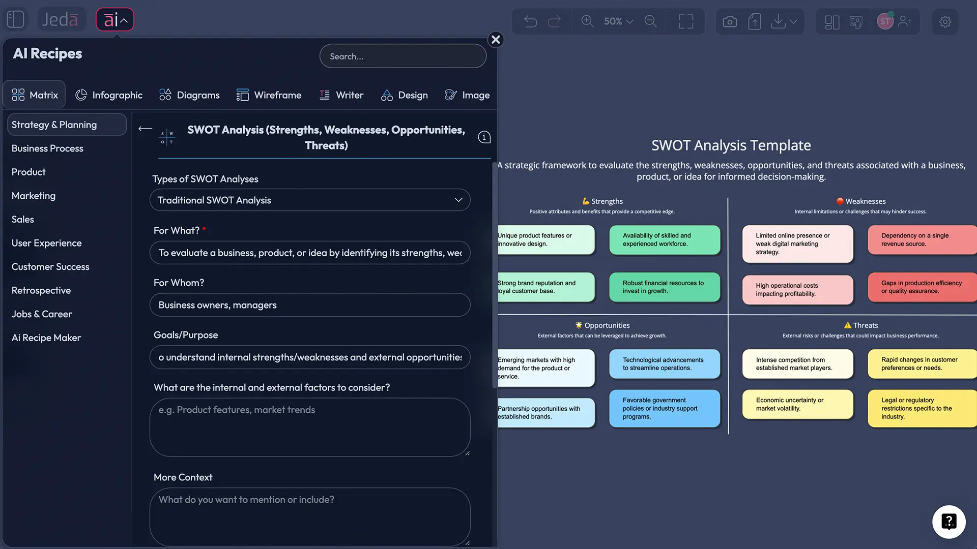
Matrix — Ideal for frameworks, comparisons, and strategic analysis. Your SWOT analysis, competitive positioning matrix, or risk/benefit grid renders as a structured grid with clear quadrants. Best for: strategic planning, executive presentations, framework-based thinking.
Flowchart — Process flows, decision trees, and sequential analysis. If your data describes a workflow or decision path, flowchart shapes and directional connectors show the flow. Best for: sales processes, customer journeys, approval workflows, funnel analysis.
Mindmap — Hierarchical expansions and topic breakdowns. Data organized into a central concept with branching themes and sub-themes. Best for: brainstorming, root cause analysis, competitive landscape mapping, idea clustering.
Diagram — Flexible network structures. Unlike mindmaps, diagrams allow multiple connections between nodes, perfect for system relationships, competitive ecosystems, or stakeholder networks. Best for: organizational charts, system architecture from data, relationship mapping.
Stickynotes — Key takeaways as free-form sticky notes. Data Insight extracts the 5–10 most important insights and renders them as individual notes. Best for: quick takeaway sharing, brainstorm capture, insight democratization, team alignment.
Text — Detailed written analysis. A comprehensive narrative summary of your data with insights, trends, and recommendations in prose. Best for: reports, deep-dive documentation, stakeholder briefings, archive and reference.
Wireframe — Layout visualization. Less common for data analysis, but useful if you're visualizing UI layouts or customer experience flows from user research data. Best for: product design, UX analysis, interface planning.
Infographic — Visual summaries with icons, sections, and metrics. Data Insight summarizes your analysis into a polished infographic with key numbers, trends, and visual hierarchy. Best for: social sharing, executive summaries, one-page overviews, client presentations.
Here's the best part: you're not locked into one choice. Generate as a matrix, then Vision Transform to a flowchart. Export both for different audiences. Your data, your format, your choice.
Real-World Examples
Example 1: SWOT Analysis from Sales Data
Your team just closed Q3. You have a CSV with deal counts by segment, churn rates, new market entries, and competitive losses. Upload it to Data Insight, select Matrix, and ask for a SWOT analysis. In 60 seconds, you have:
Strengths: High deal velocity in enterprise segment (+40% YoY), successful entry into EMEA market, strong retention in core customer base (91%).
Weaknesses: Mid-market churn (15%, up 3%), sales cycle lengthening (from 60 to 75 days), low win rate against competitor X in new segments.
Opportunities: Untapped SMB segment (50K+ addressable market), upsell potential in existing base (customers using 2 of 8 features), emerging vertical (healthcare) showing high win rate.
Threats: Competitor X gaining share in EMEA (24% market share vs. our 18%), price compression in legacy segment, customer consolidation reducing addressable market in one vertical.
No consultant. No meeting. No 4-hour workshop. Just data → AI analysis → strategy in a visual matrix.
Example 2: Competitive Positioning Matrix from Market Research
You've been researching 10 competitors. Your spreadsheet has company names, pricing, feature count, customer segment focus, and growth rate. Upload to Data Insight, select Matrix, and ask for a competitive positioning matrix. Axes: Price (Y) vs. Feature Breadth (X).
Result: You see clearly where each player sits. Competitors A and B are premium/feature-rich (top-right), occupying the enterprise space. Competitor C is low-cost/basic (bottom-left), targeting price-sensitive SMBs. You're in the middle. But you notice an empty quadrant: low-cost BUT feature-rich. That's your positioning opportunity.
Example 3: Sales Trend Analysis as Infographic
Q3 sales data: revenue by month, deal size by segment, sales cycle by customer type, win rate trends. Upload to Data Insight, select Infographic, and ask for a visual summary of Q3 performance and trends.
Result: An infographic showing Q3 revenue ($4.2M, +18% vs Q2), average deal size ($85K, up from $72K), sales cycle (75 days, up 10%), win rate (26%, stable), and trend indicators. Your executive team gets insights in one visual page instead of wading through a 15-slide deck.
Best Practices & Tips
Clean Your Data Before Uploading. Remove empty rows, use consistent headers, and avoid merged cells. Data Insight understands context better when the data is organized. A column called "Q3_Revenue_USD" is clearer than "Revenue" or "Numbers."
Be Specific in Your Prompt. Vague prompts ("Analyze this data") produce generic insights. Specific prompts ("Analyze Q3 sales by region, identify regions below target, and recommend actions") produce actionable analysis. Include business context when helpful: company size, market, customer type, goal. The more context, the smarter the analysis.
Choose Output Format by Audience and Goal. Matrix works for frameworks and executive decisions. Flowchart works for processes. Mindmap works for brainstorms. Infographic works for summaries. Pick based on who needs the insight and what they'll do with it.
Use AI+ to Drill Deeper. After generating, don't stop at the surface. Select a quadrant in your SWOT, tap AI+, and ask Data Insight to expand with deeper analysis, root causes, or action items. Same goes for weak points in your competitive matrix—extend to uncover more detail.
Analyze Multiple Files Together. Your data isn't all in one sheet. Upload sales data + customer feedback + market research as separate files. Data Insight can synthesize across them to find patterns you'd miss analyzing separately.
Common Mistakes to Avoid
Uploading Messy Data. Spreadsheets with inconsistent formatting, blank rows, or unclear headers confuse AI. The fix: Spend 2 minutes cleaning. Remove empty rows, standardize column names, and check for duplicates. AI's output is only as good as your input data.
Vague Prompts. "Analyze this" tells Data Insight nothing. "Analyze Q3 sales by region, highlight underperforming areas, and suggest strategies" is actionable. The more specific you are, the smarter the analysis.
Ignoring Sub-Commands. Defaulting to Text output wastes Data Insight's strength—visual frameworks. Spend 10 seconds choosing the right format. Matrix for strategy, Flowchart for process, Infographic for summaries. The format amplifies the insight.
Not Using AI+ to Extend. Your first analysis might feel surface-level. Use AI+ to expand weak points, drill into interesting patterns, or ask follow-up questions. AI+ is your conversation partner, not just an initial generator.
Forgetting Context in the Prompt. AI works better when you explain the "why" behind your data. "Our startup targets SMBs in healthcare. Analyze our market research showing competitor pricing, feature sets, and customer sentiment" gives more ammunition than "analyze competitors." Context = smarter analysis.
Frequently Asked Questions
- What is Data Insight?
- Data Insight is Jeda.ai's AI-powered analysis feature for CSV and Excel files. Upload your spreadsheet, describe what you want to understand, and Data Insight generates visual frameworks (SWOT, competitive matrices, trend analysis) with strategic insights in 60 seconds. It's available on the Shifu+ plan ($39/month).
- How do I upload a spreadsheet to Jeda.ai?
- Open your AI Workspace and go to the Prompt Bar (bottom center). Click the file upload icon (📎) next to the command selector. Select your CSV or Excel file from your computer. You can also drag-and-drop directly into the upload area. Jeda.ai auto-detects and selects Data Insight command.
- What file formats does Data Insight support?
- Data Insight supports CSV and Excel files (.xlsx, .xls). Data should have headers and organized rows. Other formats (PDF, Word documents) use Document Insight instead. For multi-file analysis, upload files of the same type together.
- Can Data Insight generate SWOT analysis from my data?
- Yes. Upload your sales, market research, or operational data. Select Matrix as your output format. In your prompt, ask for a SWOT analysis. Data Insight reads your numbers and generates a strategic SWOT matrix showing Strengths, Weaknesses, Opportunities, and Threats based on your actual data.
- How long does data analysis take?
- Approximately 60 seconds from upload to finished visual. That's a 240× speed improvement over manual analysis (4 hours → 1 minute). The AI reads your spreadsheet, extracts insights, and renders the visual framework automatically.
- What output formats can Data Insight create?
- Eight options: Matrix (strategic frameworks), Flowchart (processes), Mindmap (hierarchies), Diagram (networks), Stickynotes (key takeaways), Text (written analysis), Wireframe (layouts), and Infographic (visual summaries). Choose based on your audience and goal.
- Can I analyze multiple spreadsheets together?
- Yes. Upload multiple CSV/Excel files together and ask Data Insight to synthesize insights across them. For example, analyze sales data + customer feedback + market research simultaneously to find patterns that wouldn't surface analyzing files separately.
- Is Data Insight available on all Jeda.ai plans?
- Data Insight is a Shifu+ feature available on the Shifu ($39/month) and Alchemist ($298/month) plans. Free (White Belt) and Blackbelt ($10/month) plans don't include Data Insight. You can upgrade anytime from My Account → Edit Plan.
- How does Data Insight differ from traditional BI tools like Tableau?
- BI tools (Tableau, Power BI, Looker) require data warehouse setup, SQL knowledge, and hours of dashboard building. Data Insight needs only a CSV/Excel file, a 30-second description, and generates strategic insights instantly. BI is for ongoing dashboards; Data Insight is for rapid insight generation.
- Can I edit or customize the AI-generated analysis?
- Yes. After generation, edit text, colors, shapes, and layout like any Jeda.ai visual. Use AI+ to extend any section with more detail. Use Vision Transform to convert to a different format. Everything is editable except static Image outputs.
- Does Jeda.ai use web search with Data Insight?
- Web Search doesn't work directly with Data Insight command. However, if you use AI Recipes with data analysis enabled (via the Advance toggle), those recipes do support web search, letting you combine your spreadsheet analysis with real-time market data.
- What should I do with insights after they're generated?
- Export your analysis (PNG, SVG, PDF) and share with stakeholders. Use AI+ to drill deeper into any section. Create follow-up analyses on related questions. Present findings to your team and translate insights into strategic actions. Data → Insight → Decision → Action.
Sources & Further Reading
- [1]
Humphrey, Albert (1960s) . “SWOT Analysis: A Strategic Planning Technique” Stanford Research Institute.
View Source ↗ - [2]
Porter, Michael (1979) . “Competitive Strategy: Techniques for Analyzing Industries and Competitors” Free Press.
View Source ↗ - [3]
McKinsey & Company (2024) . “The State of AI in 2024” McKinsey Insights.
View Source ↗ - [4]
Gartner (2023) . “Magic Quadrant for Analytics and Business Intelligence Platforms” Gartner Research.
View Source ↗
Start Analyzing Your Data Today
Join 150,000+ professionals who use Jeda.ai to turn spreadsheets into strategic insights in seconds.
Try Data Insight Free