Your AI Workspace just generated a brilliant flowchart or mindmap. The structure's perfect. The layout makes sense. But it looks... generic. That's where editing comes in. Smart Shapes, text formatting, connectors, and canvas controls transform AI-generated visuals into polished, presentation-ready diagrams. This guide walks you through every tool you need to refine your content in Jeda.ai—from changing shape colors to animating connector lines. No design experience required. Just follow the steps, and watch your diagram come to life.
This tutorial covers everything you need to edit and customize AI visuals in Jeda.ai: selecting objects, changing shape types and styles, formatting text inline, connecting shapes with styled arrows, managing objects (resize, rotate, duplicate, lock, delete), and exporting your final work. By the end, you'll have the skills to transform any AI-generated visual into a professional artifact. If you haven't generated your first visual yet, start with Tutorial 1.0: Generating AI Visuals. Expect to spend about 15 minutes on this guide—less if you jump to specific sections.
Let's get started.
Note: Editing works the same whether you're working with a Mindmap, Flowchart, matrix, or custom diagram. The tools and principles are universal across Jeda.ai.
What Are Smart Shapes?
Smart Shapes aren't ordinary rectangles or circles. They're linked combinations of text and a background shape that move, style, and behave together. When you edit the text, the shape adjusts. When you change the shape color, the text remains legible (in most cases). This unity is what makes them "smart"—you're not managing two separate objects; you're editing one cohesive element.
Think of a mindmap node or a flowchart decision diamond. The text inside and the geometric container are inseparable. You'll find Smart Shapes in sticky notes, matrices, connectors, and any Jeda.ai diagram powered by AI. The key difference from static shapes in tools like PowerPoint or Google Slides: your Smart Shape adapts as you refine it. In the AI Whiteboard, these elements are your building blocks.
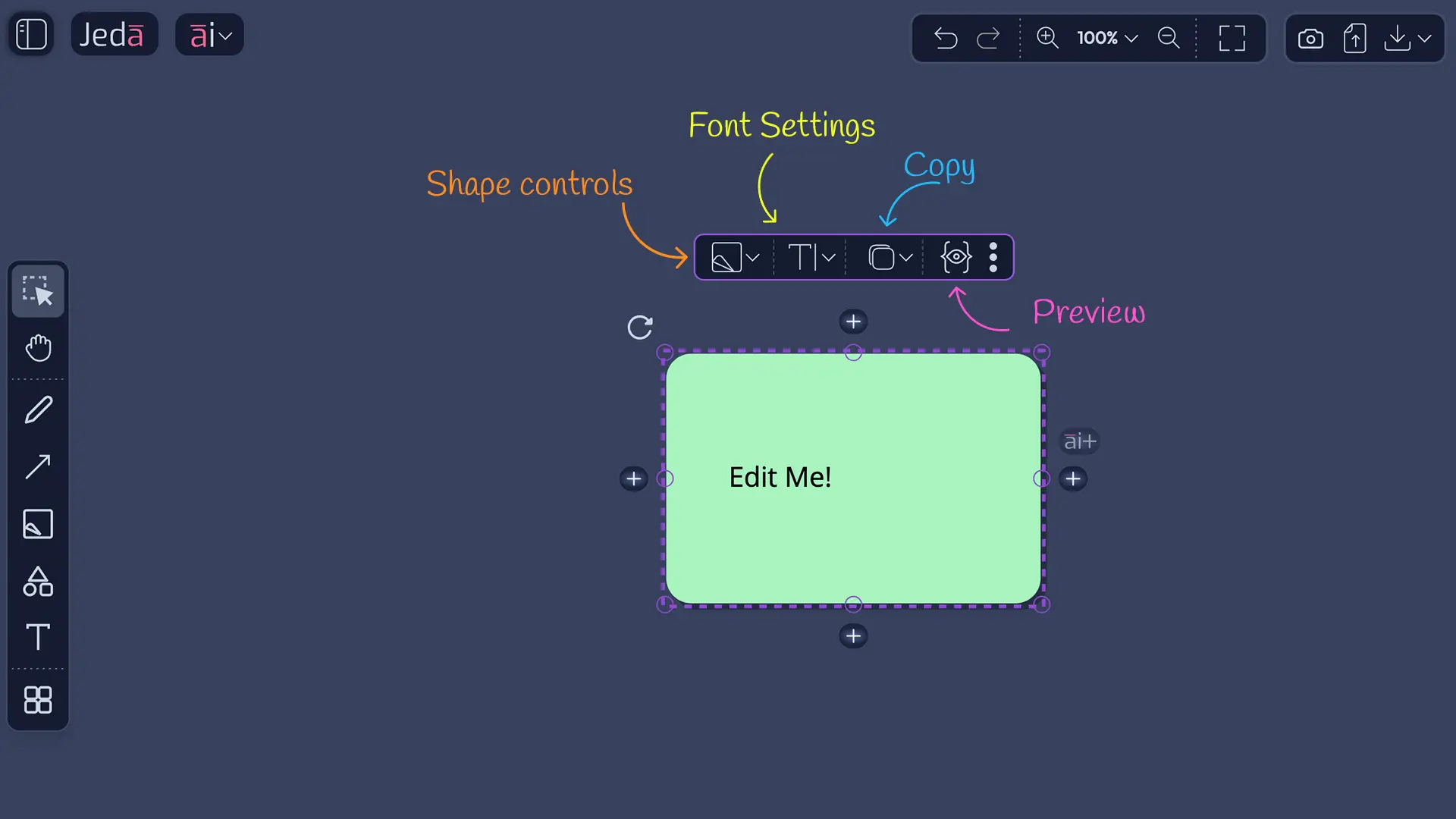
The Floating Toolbar: Your Editing Command Center
Every time you select a Smart Shape, a toolbar appears above it. That's the floating toolbar—your primary control panel for editing existing objects. Don't confuse it with the left sidebar (which creates new objects). The floating toolbar customizes what's already there.
The floating toolbar has five main buttons:
- Shape/Style (palette icon): Change shape type, colors, borders, shadows
- Text (🔤): Edit and format text inline
- Duplicate (📋): Create copies with directional and spacing control
- Preview (👁️): View how your shape renders
- More Options (⋮): Lock, delete, or download
This toolbar appears above every selected shape, every connector, every text block. It's context-aware—buttons change based on what you've selected. Click a connector, and you see connector-specific controls. Click a shape, and shape controls appear. It's the unified command center for the 150,000+ users refining visuals in Jeda.ai.
Selecting & Navigating Smart Shapes
How to Select an Object
Click any shape on your canvas. You'll see a purple dashed border appear around it, with small square handles at the corners and edges. The floating toolbar materializes above the shape. You're now in edit mode for that object. Click somewhere empty on the canvas, and the selection disappears. That's it. No right-click menus in Jeda.ai—selection is simple and direct.
Understanding Canvas Controls
A selected shape shows more than just a toolbar. Around the shape's perimeter, you'll see several interactive handles and buttons. Each one does something specific.
Resize handles (small squares at corners and edges): Drag corner handles to resize proportionally and maintain aspect ratio. Drag edge handles to stretch one dimension. Useful when you need a shape larger to fit more text, or smaller for visual emphasis.
Rotation handle (circular arrow near the top-left): Drag this to rotate the shape 360 degrees. Rotation snaps to rough angles, helping you maintain alignment with other objects. If rotation looks off, press Ctrl+Z to undo.
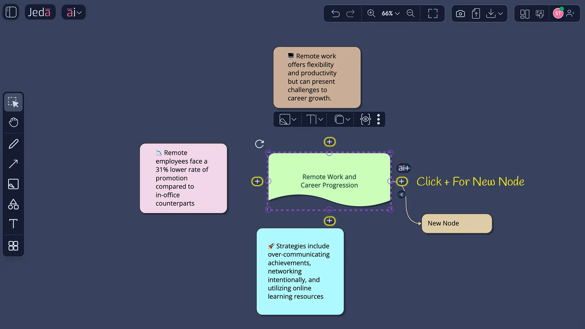
AI+ button (on the right side): Click this to generate related content branching from this node. Unique to Jeda.ai, the AI+ button extends your thinking by creating child nodes or related elements automatically.
Connection buttons (+ symbols on four sides): Click any of these to manually create a new connected node in that direction (up, down, left, right). Useful when you want to add a specific node without using AI generation.
Fold/Unfold buttons (< and > symbols, usually on the right): In mindmaps and hierarchical diagrams, these collapse or expand child branches. Hide details to simplify your view, or expand to see the full structure.
All these controls work in tandem. You can resize, rotate, and connect without ever leaving the shape. The Visual AI Whiteboard design keeps you focused on content, not wrestling with menus.
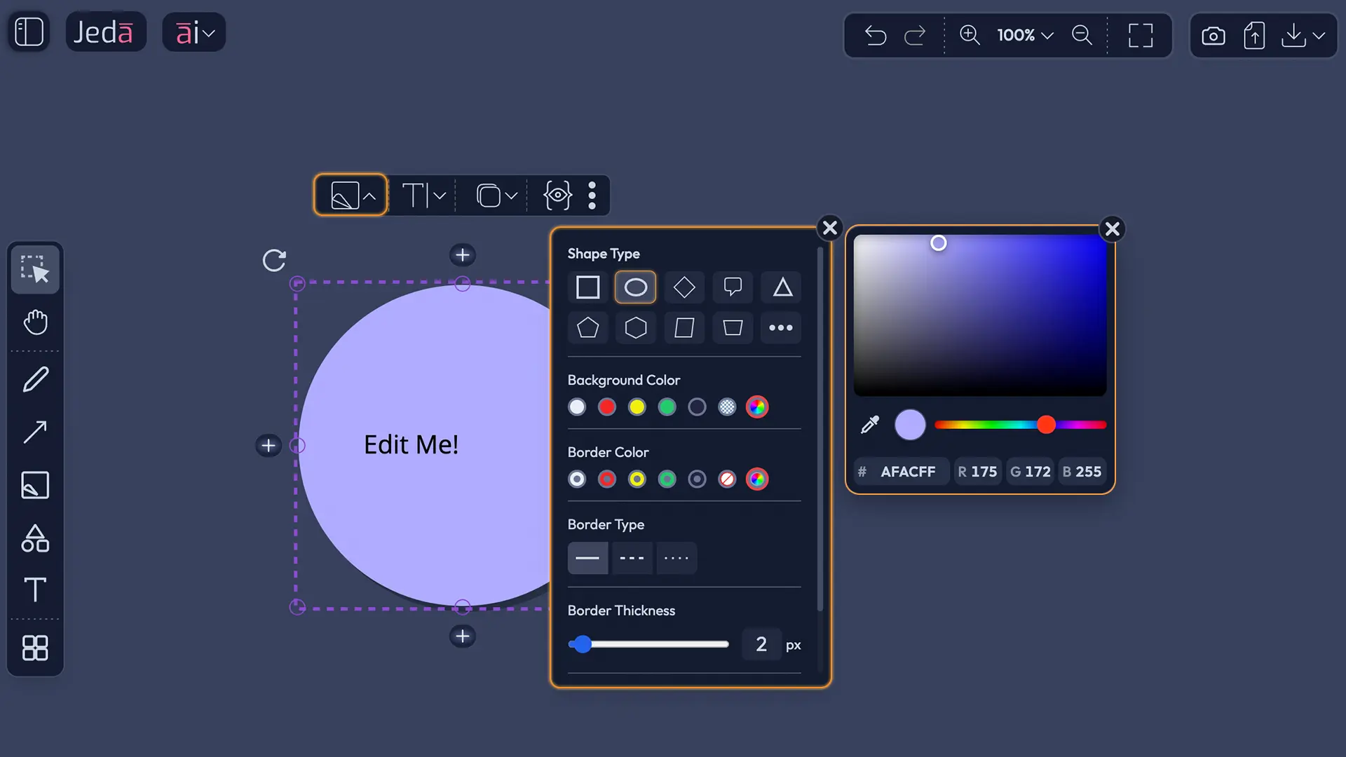
Shape/Style Panel
Changing Your Shape Type
Click the Shape/Style icon (palette) in the floating toolbar. A panel opens showing 10+ shape options: rectangle, circle, diamond, speech bubble, triangle, pentagon, hexagon, document, trapezoid, and more. Each shape has a use. Rectangles are general-purpose. Diamonds indicate decision points (ideal for flowchart conditionals). Circles and ovals soften design. Speech bubbles add personality. Triangles signal warning or highlight. Choose the shape that best represents your content's role.
As you hover over each option, you'll see a live preview—the selected shape transforms on the canvas instantly. No guessing. Once you find the right shape, click it. The panel closes, and your shape updates.
Customizing Colors
The Shape/Style panel lets you control two color layers: background and border.
Background Color: Click the background color circle to choose from 7 presets (including brand colors and neutrals) or open the rainbow color picker for unlimited options. Light backgrounds with dark text offer strong contrast for readability. Dark backgrounds with light text work equally well.
Border Color: Separate from background. Choose 7 presets, the no-color option, or the rainbow picker. Many shapes look cleaner with no border. Others benefit from a contrasting border that frames the content and separates it visually from nearby shapes.
Accessibility tip: Avoid light gray text on white backgrounds or dark gray on black. Test your colors by squinting—if you can't distinguish the text, neither can your audience. High contrast improves readability on screens and in presentations.
Styling Borders
If you want a border, control its appearance with three settings:
Border Type: Solid (clean, professional), Dashed (suggests preliminary ideas or optional steps), or Dotted (lighter visual emphasis). Each style previews as you select it.
Border Thickness: A slider from 0 to 10 pixels. Most diagrams use 1–3 pixels. Thicker borders (4–6 px) add weight and emphasis. Very thick borders can overwhelm.
Border Roundness: A slider that rounds the corners of your shape. Rectangles with rounded corners look modern. Diamonds and circles don't change much. Use slight rounding (5–10 px) for a polished feel; heavy rounding (15+ px) looks playful.
Pro tip: Use dashed borders for work-in-progress elements. When your diagram is final, switch to solid borders for a finished look.
Shadow Effects
Three shadow options create depth or framing:
Shadow: A soft drop shadow behind the shape, adding dimension and making the shape appear to float above the canvas.
Outline Shadow: A colored frame around the shape, as if the shape sits inside a border. Creates containment without adding a traditional border.
No Shadow: Clean, flat appearance. Works well for minimalist designs or when you have many shapes (shadows can make layouts feel cluttered).
Experiment. A single emphasized shape with a shadow draws attention. Multiple shadowed shapes compete for focus. Use shadow sparingly unless you're designing for depth.
Text Editing & Formatting
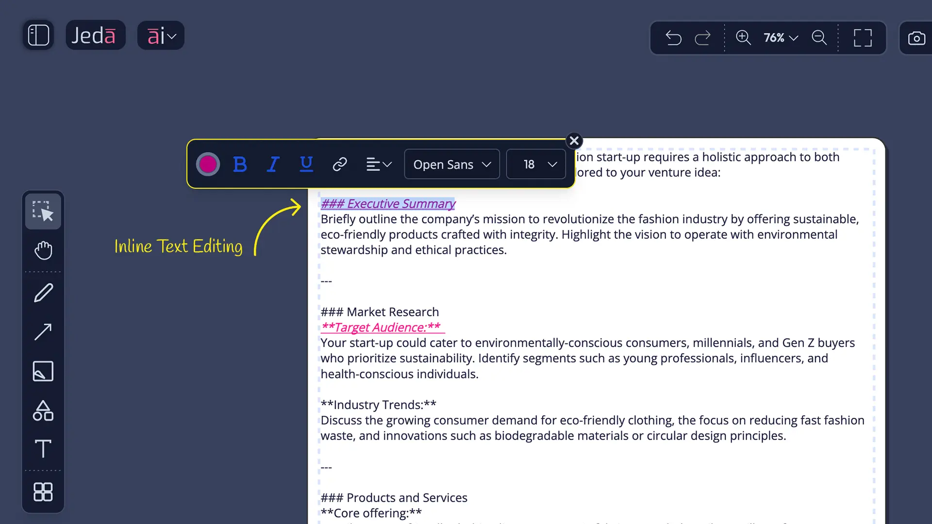
Inline Editing (Double-Click Method)
Double-click any text in a shape. The text becomes editable—you'll see a blinking cursor. An inline formatting toolbar appears above the text with font, size, color, bold, italic, underline, alignment, and link options. This is where non-designers feel most comfortable. It's familiar: click, type, format, exit.
Type or edit as needed. Highlight specific words to apply formatting to just that selection. When done, click elsewhere on the canvas or press Escape. Your changes save instantly.
Text Formatting Toolbar (In-Line)
Once the inline toolbar is visible, you have full control:
Font selection: Choose from sans-serif (Helvetica, Arial—best for screens), serif (classic, formal), or monospace (technical, code-like). Most diagrams use sans-serif for clarity.
Font Size: A slider typically ranging from 12 to 48 pixels. Larger text is easier to read in presentations; smaller text fits more content in small shapes.
Color picker: Change text color independently from the shape's background color. Dark text on light backgrounds. Light text on dark backgrounds. Avoid mid-tone text that lacks contrast.
Bold / Italic / Underline: Standard formatting. Bold emphasizes key terms. Italic suggests a citation or alternative. Underline links (applied automatically when you insert a URL).
Alignment: Left, Center, or Right. Center alignment looks balanced and polished. Left alignment is default for paragraphs. Right alignment is rarely used unless you're creating intentional asymmetry.
Insert Link (🔗 icon): Highlight the text you want to link. Click the link icon. Paste a URL. The text becomes clickable; hover shows the URL. Links don't work in PNG/PDF exports—they're active only if you're sharing the live Jeda.ai board.
Text Best Practices
Keep text concise. Smart Shapes have limited space. A long paragraph shrinks to unreadable size. Aim for 1–5 words per shape. If you have more content, split it across multiple shapes and connect them.
Use bold for hierarchy. In a shape with multiple lines, bold the main concept; leave supporting details regular weight. This creates visual structure at a glance.
Align center for balance. Left-aligned text works in flowcharts if your style is consistent, but centered text feels more intentional and polished.
Test contrast with your teammates. Ask: "Can you read this from 3 feet away?" If the answer is no, increase font size or change colors.
Links in shapes are powerful in live boards but don't export to static files. Use links for internal navigation in collaborative boards; if you're exporting to PowerPoint or email, describe the link in the shape text instead (e.g., "Learn more at jeda.ai").
Connectors: Lines & Arrows
How Connectors Are Created
Connectors appear in two ways. Automatically, when you use AI features or the + buttons on a canvas control. The AI determines logical relationships and creates connectors automatically. Manually, using the arrow tool in the left sidebar: select it, click a source shape, click a target shape, and a connector is born.
Connectors are smart. When you move connected shapes, connectors adjust their path automatically. They don't break. They flow with your edits. This intelligence makes diagrams responsive to change.
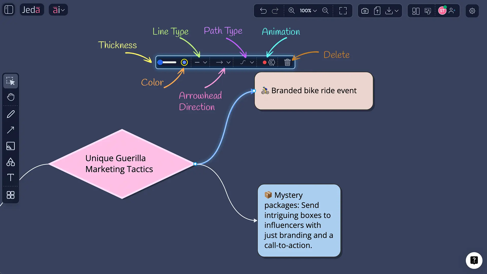
Selecting & Styling Connectors
Click a connector line. It highlights in blue, and a Connector Toolbar appears. This toolbar is your control panel for line customization.
Thickness slider: 1–8 pixels. Thin connectors (1–2 px) feel delicate, good for secondary relationships. Thick connectors (4–6 px) emphasize flow, ideal for primary sequences. Most diagrams use 2–3 px.
Color circle: 7 color presets or the rainbow picker. Match connector color to the shapes it connects (visual coherence), or use contrasting colors (visual emphasis). Many diagrams use neutral grays or blacks for connectors to avoid visual chaos.
Line Style: Solid (standard, professional), Dashed (suggests tentative connections, alternatives), or Dotted (lighter visual emphasis, decorative). Most diagrams use solid for clarity.
Arrow Direction: Forward (→, shows flow direction), Backward (←, reverses flow), Both (↔, shows bidirectional relationship), or None (simple line, no arrow). Most flowcharts use forward arrows. Mindmaps often use no arrows since the hierarchy is visual.
Curve Type: Curved (smooth, flowing, default), Straight (angular, direct), Orthogonal (right angles, structured), Bezier (advanced, allows hand-drawn curves), or Elbow (right angles with fewer segments). Curved connectors feel organic. Orthogonal connectors feel structured and technical. Test what works for your diagram's tone.
Animate toggle: ON turns on a flowing colored dot animation along the connector. It moves continuously, showing direction and energy. OFF keeps the line static. Animations work in live boards and some exports but don't appear in PNG/PDF downloads. Use animation for presentations and interactive boards.
Delete: Removes the connector without affecting the shapes it connected. Useful when you want to break a relationship.
Endpoint Management
Click a connector and look for small circles at each end (source and target). Drag either circle to a new shape. This reattaches the connector without deleting and recreating. Useful when you want to change flow direction after AI generation—drag the arrow endpoint to a different node, and you've redirected the relationship.
If a connector endpoint doesn't attach perfectly to a shape, drag it again. The connector snaps to the nearest attachment point.
Connector Animation
Animate is a toggle. Click it ON, and a flowing dot travels along the connector's path, colored to match the line. It loops continuously. OFF removes the animation. Animation is especially effective in presentations—it draws the eye along the flow and helps audiences follow complex sequences. Performance impact is minimal; Jeda.ai handles animation smoothly even with dozens of animated connectors.
Use animation for:
- Presentations where you're explaining a process
- Boards you're sharing with stakeholders to show flow direction
- Mindmaps where animation emphasizes branches and hierarchies
Don't animate if your diagram is static and exported to PDF—animation won't appear in downloaded files, so it's wasted effort.
Connector Pro Tip: In flowcharts, keep all connector lines the same thickness and color for consistency. In mindmaps, you can vary thickness to show primary vs. secondary branches—thicker for main ideas, thinner for details.
Object Operations: Resize, Rotate, Duplicate, Lock, Delete
Resizing Objects
Two methods. Proportional resize: Drag a corner handle. The shape grows or shrinks while maintaining its aspect ratio. Use this when you want symmetry. Stretch: Drag an edge handle (top, bottom, left, right) to change one dimension. Use this when you need a shape wider or taller without changing the other axis.
When you resize, text inside often scales automatically. Very small shapes can shrink text below readable size. Solution: either make the shape larger, or double-click and reduce the text content.
Rotating Objects
Click the rotation handle (circular arrow near the top-left of a selected shape) and drag in the direction you want to rotate. You can rotate a full 360 degrees. The shape snaps to rough angles (every ~15 degrees), making it easier to maintain alignment with other elements. If you over-rotate or don't like the angle, press Ctrl+Z to undo.
Rotation is rarely needed in structured diagrams (flowcharts, matrices) but shines in freeform boards or when you want to add visual interest to a title or callout shape.
Duplicating with Direction & Spacing
Click the Duplicate icon (📋) in the floating toolbar. A panel appears asking:
Direction: Right, Left, Up, or Down. This determines where the copy appears relative to the original.
Spacing: A slider (usually 0–50 pixels). Sets the distance between the original and the copy. Default is 10 px. Increase spacing if you're creating a grid and want breathing room. Decrease if you want shapes clustered.
Click Duplicate, and the new shape appears instantly, with all styles, colors, and text copied. This is powerful for building repetitive structures. Need 5 process boxes in a row? Duplicate once with "Right" and 20 px spacing. Select the new shape and repeat. You've built a sequence in seconds.
Duplication also copies connector relationships if applicable—be aware that connections copy alongside the shape.
Locking Objects
Click the More Options button (⋮) in the floating toolbar. Select Lock. The shape is now locked: you cannot select it, move it, resize it, delete it, or create connections from it. A lock icon appears on the shape.
Why lock? In collaborative boards, locked shapes protect key structures. Lock your diagram title or the main framework shapes so teammates can't accidentally move them. Lock shapes while you're reorganizing other parts of the diagram to keep them stable.
To unlock, click the locked shape (you can still select it), then toggle Lock OFF in More Options.
Deleting Objects
Click More Options (⋮) and select Delete. If you're working solo, the shape disappears instantly. If you're in a collaborative board, you might need to confirm deletion (to prevent accidental removal). Deletion is permanent—there's no undo after you close and reopen the board. Use Lock instead if you're unsure whether you want to delete something.
When you delete a shape that's connected, only that shape is removed. Connectors attached to it are deleted, but other connected shapes remain intact. The diagram stays whole; only that node is gone.
Preview & Export
Live Preview
Click the Preview icon (👁️) in the floating toolbar. A preview pane opens showing how the shape renders in context. For HTML content or embedded elements, preview shows how they display. For regular shapes, you'll see the final colored, styled appearance.
Use preview before exporting to catch any visual issues—text color contrast, shape sizing, alignment—that you might have missed in edit view.
Export Options
Click More Options (⋮) and select Download. A dialog appears with format options:
PNG: Raster format. Best for social media, email, embedded in documents. Choose transparent background if you plan to overlay the image on colored slides or backgrounds. Default is white background. File size is small; quality is high on screens. Animations don't export to PNG.
SVG: Vector format. Scalable infinitely without quality loss. Can be imported into design tools like Figma or Illustrator and edited further. Best if you want to refine the visual later or share with designers. SVG also preserves some interactive elements if you're sharing the asset with developers.
PDF: Document format. Multi-page support if you have multiple boards. Best for reports, print materials, or archiving. Animations don't appear in PDF; connectors are static. Quality is excellent for print.
Choose based on your use case. PNG for quick sharing. SVG for design assets. PDF for formal documents.
File naming is automatic with timestamps, ensuring you don't accidentally overwrite previous exports. You can rename the file after download.
How to Customize a Smart Shape: Step-by-Step
Here's the most common editing task: you've generated a flowchart, and you want to customize the first shape. Change its color, bold the text, and adjust the border. Follow these steps, and you'll have a polished shape in 2–3 minutes.
- Click the shape
On the canvas, click the shape you want to customize. A purple dashed border appears, indicating selection. The floating toolbar materializes above the shape.
- Open Shape/Style panel
Click the Shape/Style icon (palette) in the floating toolbar. A panel opens showing shape type, colors, borders, and shadow options.
- Choose background color
In the Shape/Style panel, click the background color circle. Select a preset color or open the rainbow picker for custom colors. Choose a color that contrasts with your text (dark background = light text, or vice versa).
- Select border color
Click the border color circle. Choose a color that frames your shape without overwhelming it. Many diagrams use a darker shade of the background color or neutral gray. Or choose no border if you prefer clean lines.
- Adjust border thickness
Use the border thickness slider to set a width (1–3 pixels is typical). Preview the change on the canvas. A border should frame the shape without taking over.
- Close the panel
Click elsewhere on the canvas or press Escape. The Shape/Style panel closes. Your shape now has the custom colors and border you chose.
- Double-click the shape text
Double-click the text inside the shape to enter edit mode. A blinking cursor appears, and the inline formatting toolbar appears above the text.
- Select all text
Press Ctrl+A (Windows) or Cmd+A (Mac) to select all the text in the shape.
- Apply bold formatting
Click the Bold button (B) in the inline formatting toolbar. The text becomes bold, adding emphasis and clarity.
- Adjust text color if needed
Click the color picker in the inline toolbar to ensure the text color contrasts with the shape's background. High contrast = readable from a distance.
- Exit text editing
Click elsewhere on the canvas or press Escape. The text toolbar closes, and your text changes are saved.
- Review your work
Step back and look at the customized shape. Does the color scheme work? Is the text readable? Does the shape's appearance reflect its role in the diagram?
- Duplicate for consistency
If you have similar shapes elsewhere in your diagram, select this customized shape and click Duplicate. Choose direction and spacing. You've just built consistency across your visual.
Congratulations. You've customized a Smart Shape from AI-generated default to polished, professional appearance. Repeat this process for other shapes, and your entire diagram transforms. The AI gave you the structure. You've added the personality.
FAQ
- What's the difference between shapes in the left toolbar and the Shape/Style panel?
- The left sidebar contains template starters for creating brand-new objects from scratch. The Shape/Style panel (floating toolbar) converts existing shapes into different types. You customize existing content with the toolbar; you create new objects with the left sidebar. This separation keeps tools organized: Left sidebar = create. Floating toolbar = refine.
- Can I style shapes differently if they're connected?
- Yes. Each shape and connector is independent. You can customize colors, borders, shadows, and text formatting for individual shapes without affecting others, even if they're connected. Connectors style separately (thickness, color, line style, animation). This independence lets you create visual hierarchy and visual emphasis throughout your diagram.
- What happens to text when I resize a shape?
- Text scales automatically to fit the new shape size (in most cases). If the shape becomes very small, text may shrink below readable size. Solution: use inline editing (double-click) to reduce text content, or resize the shape larger. Text wrapping adjusts based on shape width automatically.
- Can I undo shape changes?
- Yes. Ctrl+Z (Windows) or Cmd+Z (Mac) undoes your last action: styling change, text edit, rotation, deletion, or duplication. Undo history persists for several actions. However, if you close and reopen the board, undo history clears. Save your board before closing if you want to preserve version history.
- What's the best way to format text for accessibility?
- Use sufficient contrast: dark text on light shapes, light text on dark backgrounds. Avoid light gray text. Use sans-serif fonts (Helvetica, Arial) for screen readability. Keep font size 14 pixels or larger. Use bold sparingly for emphasis, not entire blocks. Test with teammates; ask if text is readable from a distance.
- How do I change a connector style without recreating it?
- Click the connector line to select it (blue highlight appears). The Connector Toolbar appears. Use controls to change thickness, color, line style (solid/dashed/dotted), arrow direction, or curve type. All changes apply instantly. To reattach the connector to different shapes, drag the endpoint circles to new targets.
- Can I duplicate multiple shapes at once?
- Duplicate works one shape at a time. To create multiple copies with consistent spacing, duplicate each individually using the Direction and Spacing settings. For large groups, duplicate once, then repeat with the same settings. Alternatively, generate multiple shapes via AI and edit them together.
- What's the difference between locking a shape and hiding it?
- Locking prevents selection, editing, deletion, moving, or connecting. Locked shapes remain visible and take up space. Hiding (not available in Jeda.ai) would remove it from view entirely. Use lock for shapes you want visible but untouchable, such as titles or key structure elements. Delete if you don't need the shape anymore.
- Which export format should I use for my presentation?
- PNG for most use cases: embeds in slides, emails, and documents; works everywhere. SVG if you plan to edit later (resize in Figma, adjust colors). PDF for multi-page reports or printing. Transparent PNG if you need flexibility to overlay on colored backgrounds. Test your export before sharing to ensure quality.
- Can I edit shapes after exporting them?
- Exported files (PNG, SVG, PDF) are static snapshots. You cannot edit them within Jeda.ai after export. To make changes, return to the board, edit the shapes, and re-export. SVG exports are editable in design tools (Figma, Illustrator), but changes there won't sync back to Jeda.ai.
- How do I handle multiple shapes connected to one node?
- Each connector and shape is independent. Select each connector individually to change its color, thickness, or style. A single node can have multiple incoming and outgoing connectors, each styled differently. This flexibility lets you show different types of relationships in one diagram—thick connectors for primary paths, thin for secondary.
- What if my shapes overlap after duplication?
- Overlapping shapes happen when spacing is too small. Select the overlapping shape and drag it to a new position. Or, delete the overlapping copy and duplicate again with larger spacing. In dense diagrams, use the canvas zoom feature to zoom out, see the full layout, and adjust spacing visually.
Master Your Visuals
You now have the complete toolkit to edit AI-generated visuals in Jeda.ai. Smart Shapes aren't mysterious—they're linked text and background objects that respond to your styling choices. The floating toolbar is your command center; the Shape/Style panel, text formatting options, and connector controls give you precision.
From changing a shape's color to animating connector flow, you're no longer bound by AI defaults. You're a visual editor, refining ideas into artifacts your team can share, understand, and act on. The 300+ strategic frameworks available in Jeda.ai—Mindmaps, Flowcharts, matrices, and beyond—all benefit from these editing techniques.
Start small. Customize one shape. Format its text. Add a connector and animate it. Watch your diagram transform. The repetition builds muscle memory. Soon, you'll customize a 50-node flowchart without thinking. And that's when Jeda.ai becomes more than a whiteboard—it becomes an extension of your thinking.
Ready to dive deeper? Explore Tutorial 1.3: Mastering Mindmaps for structure-specific tips, or Tutorial 1.4: Building Flowcharts for process-oriented workflows. Or check out Design Principles for Visual Thinking to learn color theory and visual hierarchy in detail.
Your visuals are waiting. Polish them.
- [1]
- [2]
Medium (Vijay Chintha) . “Unveiling the Secrets: Understanding Animated Connectors in Architectural Diagrams” Medium.
View Source ↗ - [3]
Atlassian . “Visual Collaboration with Whiteboards” Atlassian.
View Source ↗ - [4]
Microsoft . “Tips and Tricks for Microsoft Whiteboard” Microsoft.
View Source ↗ - [5]
SMART Technologies . “Moving, Resizing, Rotating, and Locking Objects in SMART TeamWorks” SMART Tech.
View Source ↗
Ready to customize your next visual?
Log in to Jeda.ai and try these techniques on your own diagrams.
Open Jeda.ai