Jeda.ai Feature Release is here with a sharper point of view: business teams should not have to choose between smart thinking, visual communication, and collaborative clarity. In this release, Jeda.ai adds Draw, a new command for generating editable SVG visuals from natural language, and Creator Heatmap, a collaboration layer that makes authorship visible across a shared canvas. Add the routine upgrades and fixes underneath, and this becomes more than a small polish release. It changes how work moves from idea to explanation to decision.
This matters because most teams still break their workflow in the middle. They reason in one tool, redraw in another, then argue in a third. That is slow. Worse, it strips context out of the work. Jeda.ai already gives teams an AI Workspace and an AI Whiteboard built for visual thinking. This release pushes that advantage further by making outputs more editable and collaboration more accountable.
What changed in this release
The headline is simple. One feature helps teams generate richer visuals without leaving the canvas. The other helps teams see ownership without starting a coordination meeting that should have been an overlay.
- Draw command
Generate editable SVG visuals from natural language prompts. Think diagrams, infographics, data charts, and high-fidelity wireframes that stay flexible after generation.
- Creator Heatmap
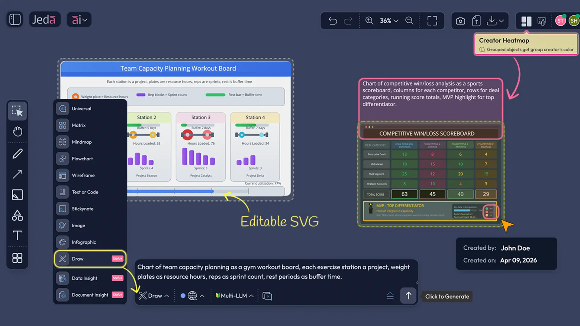
See who created which section of a shared canvas through avatar-matched color coding, hover details, and a private personal view you can toggle on or off.
- Routine upgrades and fixes
Under-the-hood improvements keep the workspace cleaner, steadier, and less distracting, so the new capabilities land on a more reliable day-to-day foundation.
For consultants, that means fewer hours translating smart analysis into client-ready visuals. For decision makers, it means less ambiguity around who built what and when. For MBA and EMBA cohorts, it means clearer group work, cleaner presentation assets, and less friction between teamwork and final delivery.
Draw gives your ideas a visual body, not a dead-end image
Draw is not another static image button with a fancier label. It is a new command that turns natural-language prompts into editable SVG output inside Jeda.ai. The distinction matters.
When a team generates with Draw, the result is not a flattened asset that looks nice and then becomes annoying the second you need to change a label, resize a structure, or repurpose the composition for slides. The output arrives as grouped vector content. Ungroup it, edit the pieces, move the layout around, adjust colors, update copy, and export the result in formats that fit real business workflows.
That alone changes the economics of visual communication inside a strategy team.
Business consultants can turn a framework into a presentation-grade visual without briefing a designer for every single iteration. Decision makers can ask for sharper comparisons, cleaner diagrams, or more direct executive storytelling without restarting from scratch. MBA cohorts can generate polished visual explainers for projects, workshops, and capstones, then still edit the result before presenting. The payoff is not novelty. It is control.
Why Draw matters for consultants, decision makers, and MBA cohorts
For business consultants
Consulting work often dies in the handoff between analysis and storytelling. A team may finish the hard thinking, then lose time rebuilding the message as a diagram, chart, or visual metaphor that a client can grasp in seconds.
Draw collapses that gap.
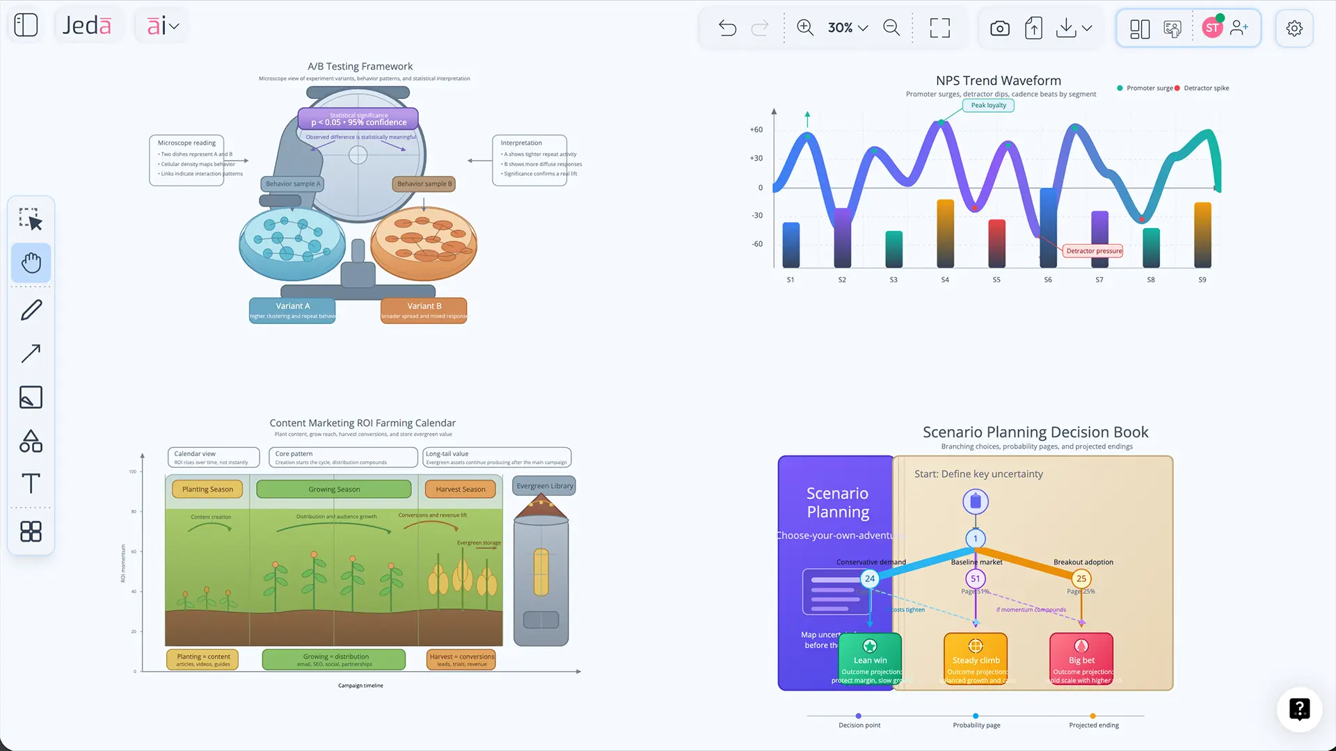
You can turn an A/B testing explanation into a lab-inspired SVG. You can transform a content marketing ROI model into a seasonal visual that executives actually remember. You can build a partner tier infographic that looks ready for a deck, then still tweak labels and hierarchy after feedback comes in. That is useful because client work rarely ships in one draft. It gets challenged. Draw survives the challenge.
For decision makers
Decision makers do not need more output. They need output that can be reviewed, edited, and reused without making the team start over. Draw helps because it creates visuals that are easier to inspect, reframe, and move into broader communication.
A strategic comparison can become a board-ready explainer. A workflow can become an onboarding story. A rough concept can become something persuasive enough to align a room. And because the result is editable, the team can refine the message as the decision evolves instead of freezing it too early.
For MBA and EMBA cohorts
Group work always sounds collaborative in theory. Then reality shows up. Someone makes the board. Someone else rewrites the summary. A third person builds the slides. By the time the team presents, the logic has been fragmented across tools and versions.
Draw makes it easier to keep the visual work inside one environment. Teams can generate a strong first draft, edit the SVG on canvas, export it, place it into slide decks or reports, and still preserve the logic of how the visual was built. That makes classwork cleaner, faster, and much easier to present with confidence.
How to use Draw in Jeda.ai
Draw is available for Shifu and Alchemist users. The workflow is direct, which is exactly how it should be.
- Select Draw from the Prompt Bar
Open the Prompt Bar, choose the Draw command, and start from a blank prompt or one of the suggested prompts.
- Describe what you want in natural language
Write the visual as you would explain it to a smart teammate. You can ask for a data chart, infographic, diagram, or high-fidelity wireframe.
- Refine with Dynamic Prompt if needed
Use Dynamic Prompt to sharpen structure, framing, audience, or visual emphasis before generation.
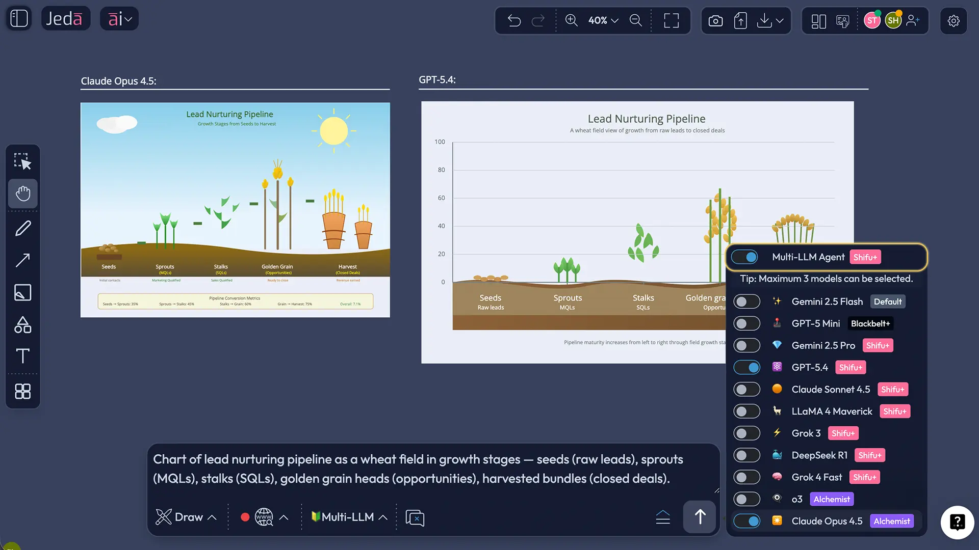
- Choose Web Search and AI models
Set Web Search if you want grounded output, then choose reasoning models from providers like OpenAI, Google, Anthropic, Grok, DeepSeek, and Meta. Multi-LLM and aggregation can be used here too.
- Generate, inspect, and ungroup
Once the SVG is generated, ungroup the output so you can edit text, colors, shapes, borders, and layout details.
- Regroup and export for delivery
After edits, regroup the visual if needed and export as SVG or PNG for use in slides, PDFs, docs, and broader presentation workflows.
Prompt examples that show Draw’s real range
Most prompt examples online are too safe. They show the surface and hide the range. Draw deserves better examples because it can sit across analytical visuals, storytelling assets, and product communication.
The interesting part is not that these prompts are clever. It is that they are useful. They turn abstract business logic into visuals people can recall after a meeting ends. That is a real advantage in consulting, teaching, and leadership communication.
Creator Heatmap makes collaboration visible without making it noisy
Now the second headline feature. Creator Heatmap sounds small until you have worked on a crowded board with multiple contributors and tried to answer a basic question: who created this section?
That question shows up everywhere. In consulting reviews. In executive planning. In classroom teamwork. In product workshops. And it usually wastes time because the board is shared but authorship is invisible.
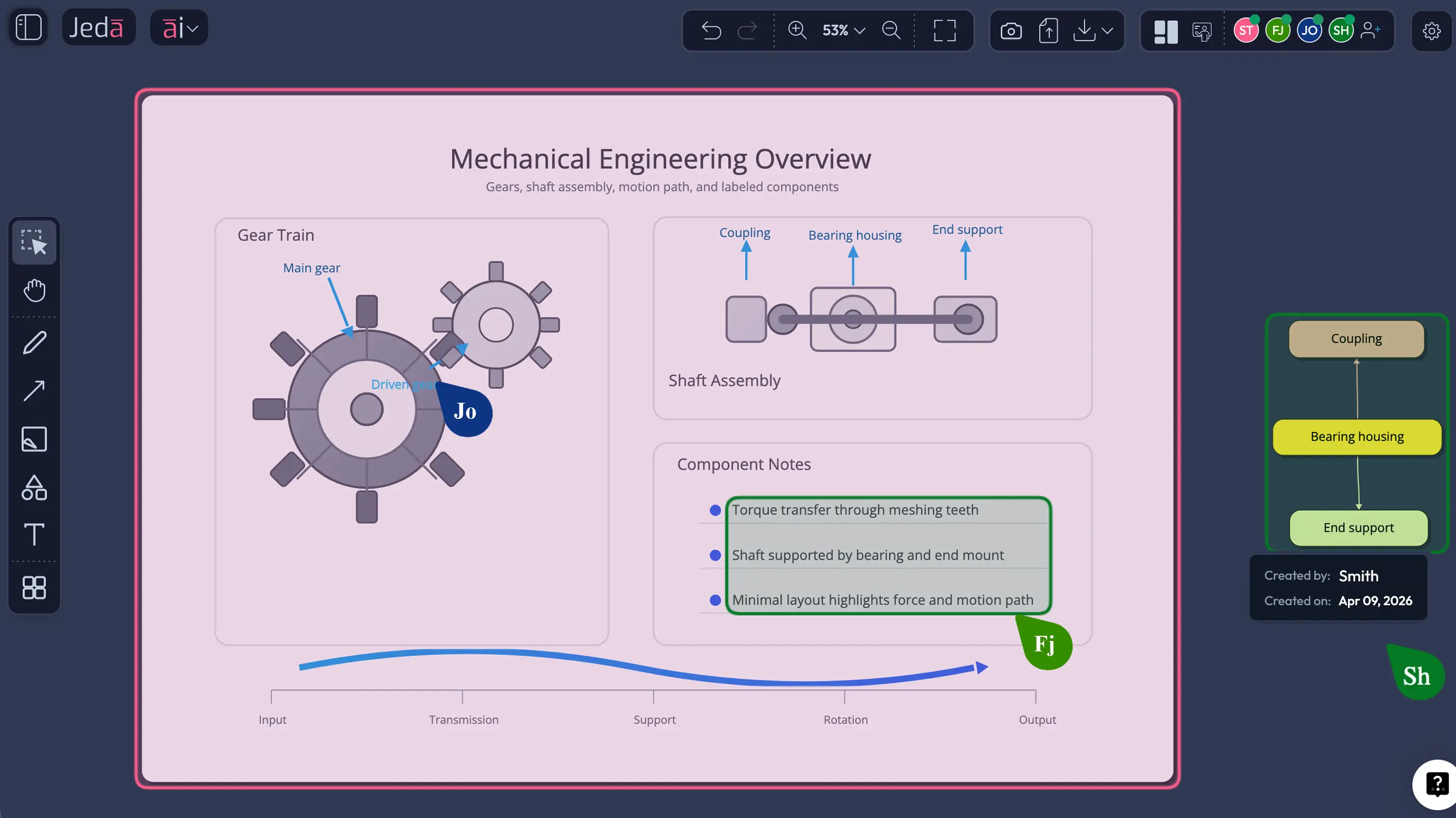
Creator Heatmap fixes that by turning authorship into an interface layer.
Click the button just left of Follow Me in the top-right area. Jeda.ai color-codes sections created by specific users based on their avatar color. Hover over a color-coded section and you see the user name and creation time. Click again and the overlay disappears. Better still, the color coding is visible only to the person who turns it on, not to every collaborator on the canvas. So the feature adds clarity without forcing a visual mode onto everyone else.
That is the right design choice. It respects shared work while giving individual users a sharper lens when they need it.
How to use Creator Heatmap
- Open your shared workspace
Enter the collaborative Jeda.ai canvas where multiple contributors have already created content.
- Click the Creator Heatmap button
Use the button placed just left of Follow Me in the top-right toolbar to turn the overlay on.
- Scan contribution zones by color
The canvas will highlight sections by creator using the same color logic tied to collaborator avatars.
- Hover for detail
Move your cursor over any highlighted section to reveal the creator name and the time that content was created.
- Use it for review, not noise
Because the overlay is visible only to you, you can inspect authorship privately without changing the board view for everyone else.
- Turn it off when finished
Click the Creator Heatmap button again to disable the overlay and return to the normal canvas view.
For MBA and EMBA teams, this becomes a simple accountability layer. For consultants, it helps separate workshop output from later refinement. For decision makers, it reduces the mystery around contribution trails in high-stakes boards. It is not flashy. It is practical. And practical wins more meetings than flashy ever will.
Routine upgrades and fixes still matter more than teams admit
Every feature release wants to talk about the shiny part. Fair enough. But the truth is simpler: teams feel product quality most often in the work between the headlines.
That is where routine upgrades and fixes matter.
In a real AI Workspace, friction compounds. Small inconsistencies slow reviews. Tiny interaction gaps break momentum. Minor rough edges force users to repeat actions they should only have to do once. So while Draw and Creator Heatmap are the visible stars, the routine upgrades underneath them are what help the release hold together in daily use.
Why this release is strategically bigger than it looks
On paper, one feature is about SVG creation and the other is about collaboration visibility. In practice, both features attack the same business problem: teams lose time when knowledge has to be translated, traced, or rebuilt by hand.
Draw reduces the translation tax. Creator Heatmap reduces the tracing tax.
That combination is strong.
Consultants can go from reasoning to client-facing visual without detouring through another tool chain. Decision makers can review collaborative work with better context and less ambiguity. MBA cohorts can manage group contribution and presentation output on the same canvas. And because the work stays inside Jeda.ai, the team preserves continuity instead of scattering it across chat threads, slide drafts, and post-meeting reconstruction.
Frequently asked questions
- What is Draw in this Jeda.ai Feature Release?
- Draw is a new Jeda.ai command that turns natural-language prompts into editable SVG visuals on the canvas. It is built for teams that want richer visual communication without giving up post-generation editing control.
- Who can use the Draw command?
- In this release, Draw is available to Shifu and Alchemist users. That makes it a premium creation layer for teams that want prompt-driven visuals plus advanced model choice, web search control, and post-generation editing.
- Is Draw the same as Jeda.ai Image generation?
- No. Draw creates editable vector output, while image generation produces static image assets. If you need to ungroup, relabel, restyle, and reorganize the result, Draw is the better fit.
- Can Draw generate more than diagrams?
- Yes. Draw can be used for diagrams, infographics, data charts, concept visuals, and high-fidelity wireframe-style compositions. The point is breadth with editability, not a narrow template category.
- Can I use Multi-LLM and aggregation with Draw?
- Yes. Draw supports reasoning-model selection, including multi-model workflows and aggregation, so teams can compare how different model families interpret the same prompt before they finalize a visual direction.
- Can I export Draw output for slides or reports?
- Yes. After editing, you can export the output as SVG or PNG. Teams can place those assets into slide decks, PDFs, docs, and broader communication workflows. SVG is especially useful when you want further shape-level editing in presentation software.
- What does Creator Heatmap do?
- Creator Heatmap color codes canvas sections by the person who created them. Hovering over a section reveals the contributor name and creation time, which helps teams review ownership without stopping to ask who made what.
- Can other collaborators see my Creator Heatmap view?
- No. In this release, the color-coded overlay is personal to the user who enables it. That means you get contribution clarity without forcing the whole workspace into a shared review mode.
- Is AI+ available for Draw or Creator Heatmap?
- No. AI+ is unavailable for both of these features in this release. Draw is driven through prompt-based generation and editing, while Creator Heatmap is a collaboration visibility control rather than an AI extension workflow.
Start Building Clearer Visual Workflows in Jeda.ai
Generate editable SVGs, review collaboration with more context, and keep strategic work on one AI Whiteboard built for real teams.
Start Free