Deployment Diagram with AI is how teams stop treating infrastructure as an afterthought. A good deployment diagram does not merely show boxes, servers, and arrows. It shows where software actually runs, what artifacts are deployed, which environments support them, and how runtime nodes communicate when the system is under pressure.
That matters because modern systems rarely fail at the idea layer. They fail at the handoff layer. A product team imagines one thing, engineering deploys another, DevOps inherits the mess, and leadership sees the problem only after latency, cost, or downtime starts throwing chairs. Jeda.ai gives teams a Visual AI way to create, review, and refine deployment diagrams inside one AI Workspace instead of rebuilding the same architecture story across chat, slides, docs, and whiteboards. It is already used by 150,000+ users and includes 300+ strategic frameworks, so the architecture work can sit beside strategy, planning, and analysis instead of floating in a separate diagramming silo.
What Is a Deployment Diagram?
A deployment diagram is a structural architecture diagram that shows how software artifacts are placed on runtime infrastructure. In UML terms, it connects deployed software with nodes, devices, execution environments, and communication paths. The Object Management Group describes UML as a graphical language for visualizing, specifying, constructing, and documenting artifacts of distributed object systems [1]. IBM’s documentation states the practical version clearly: deployment diagrams show the physical arrangement of nodes in a distributed system, the artifacts stored on each node, and the communication paths between them [2].
That is the textbook answer. The working answer is sharper.
A deployment diagram tells your team where the system lives. It answers questions like: Which service runs on which environment? Which database supports which app? Which network path carries user traffic? Which runtime node becomes risky if it fails? Which external system sits outside your control?
A component diagram explains logical parts. A deployment diagram explains runtime reality. Confusing those two is a classic architecture-documentation faceplant.
Why Create a Deployment Diagram with AI?
Creating a deployment diagram with AI speeds up the first draft, but speed is not the real prize. The real prize is forcing hidden architecture assumptions into the open before they become production problems.
In a manual workflow, one person draws what they remember. In an AI-assisted workflow, the team can start from a prompt, a cloud description, a product requirement, or an architecture note. Jeda.ai then structures the output as an editable diagram on an AI Whiteboard, where the team can correct it, add missing nodes, adjust communication paths, and turn the diagram into a decision artifact.
That is a different kind of documentation. Less museum. More control room.
- Expose runtime dependencies
Map where services, databases, devices, queues, and APIs actually run so teams can see risk instead of discussing architecture from memory.
- Plan cloud topology faster
Turn cloud deployment ideas into visual structures that show regions, environments, load balancers, storage, compute, and operational boundaries.
- Review security and reliability paths
Use the diagram to spot exposed services, missing monitoring, brittle failover paths, and unclear communication boundaries before implementation hardens.
- Align engineering and business teams
Give architects, DevOps, product managers, analysts, and stakeholders one shared visual source of truth for deployment decisions.
- Move from prompt to editable visual
Generate the first deployment view with AI, then edit labels, shapes, colors, connectors, and layout directly on the Jeda.ai canvas.
- Extend the diagram after review
Use AI+ to extend selected diagram areas after the first version exists, without treating AI+ like a separate prompt box.
When Should Teams Use a Deployment Diagram?
Use a deployment diagram when the question is not “What are the parts?” but “Where do the parts run, and how do they talk?”
That moment appears often. Before a cloud migration. Before a release review. Before a SOC review. Before a multi-region rollout. Before an AI feature connects user apps, vector storage, model APIs, queues, and internal services. Also after an outage, when the team needs a visual reconstruction of what happened and why the blast radius was bigger than expected.
The C4 model says a deployment diagram shows how instances of software systems or containers are deployed onto infrastructure within a specific environment, such as production, staging, or development [3]. That environment-specific angle is crucial. A production deployment diagram should not pretend staging looks the same. A cloud deployment diagram should not hide regional boundaries. A Kubernetes deployment diagram should not hide pods, services, ingress, secrets, and data stores behind one cheerful rectangle.
Here is the uncomfortable truth: if your deployment diagram cannot help a new engineer understand the runtime architecture in five minutes, it is probably decorative.
What Should a Strong Deployment Diagram Include?
A useful deployment diagram includes the runtime facts that affect performance, reliability, cost, and ownership. Keep it detailed enough to guide decisions, but not so packed that it becomes spaghetti wearing a tie.
Common elements include:
Cloud architecture adds another layer. AWS’s Well-Architected Framework frames architecture reviews around operational excellence, security, reliability, performance efficiency, cost optimization, and sustainability [4]. Azure’s diagram guidance says architecture diagrams help teams visualize scaling boundaries, deployment units, infrastructure dependencies, and environments [5]. Google Cloud’s architecture guidance points teams toward secure, efficient, resilient, high-performing, cost-effective, and sustainable cloud topologies [6].
That is why a modern deployment diagram should not be a static drawing of servers. It should be a reasoning surface.
How to Create a Deployment Diagram in Jeda.ai
Jeda.ai gives you two practical creation paths. The first path is the recommended one: use the Deployment Diagram recipe under the Information & Technology category. The second path is faster when you already know what you want: generate from the Prompt Bar.
Method 1: Use the Deployment Diagram Recipe
Use the recipe method when quality matters. That means architecture reviews, client deliverables, system planning, DevOps handoff, cloud migration workshops, and anything that will be shared with people who were not in the original conversation.
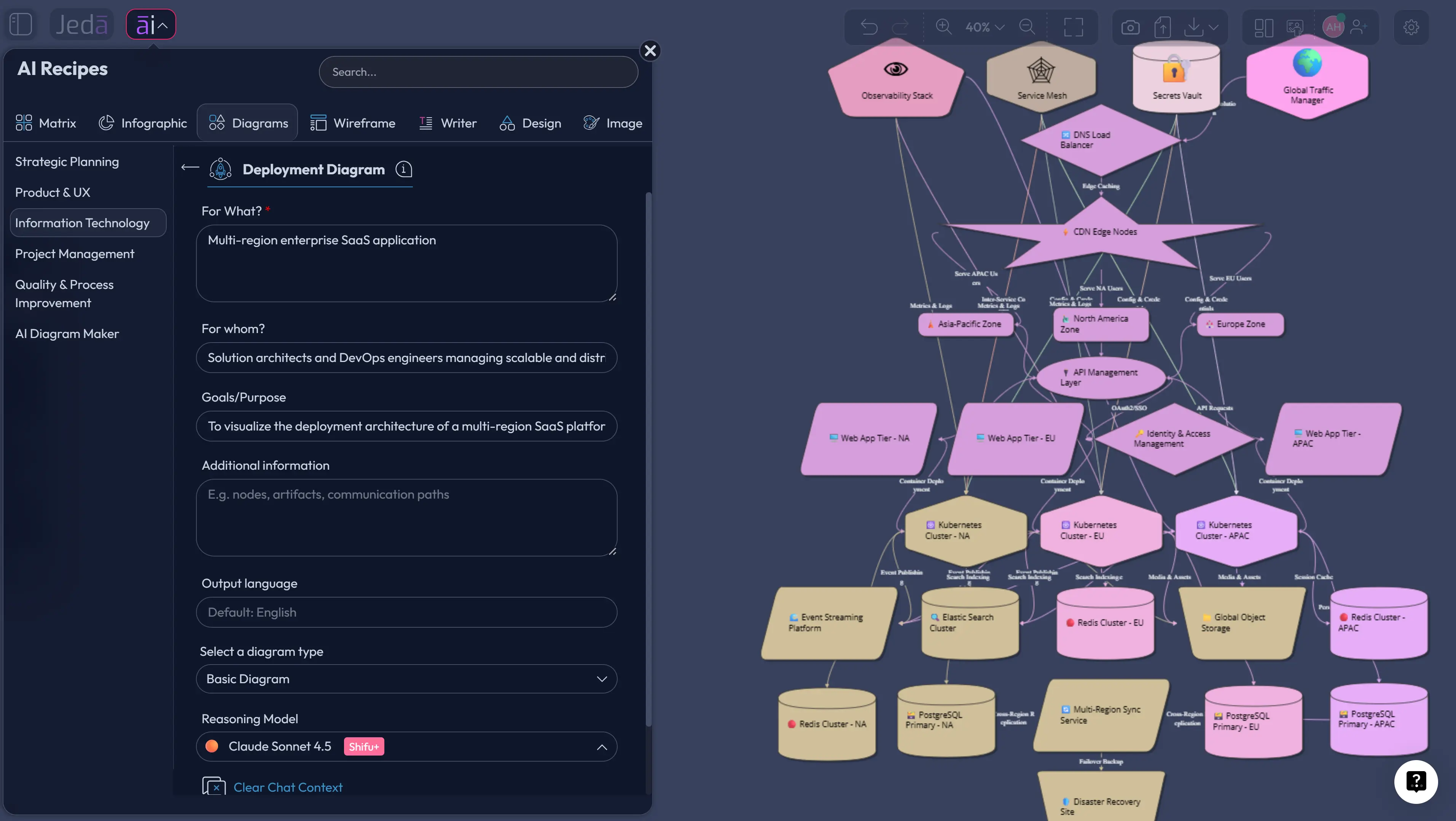
The Deployment Diagram recipe lives under the Diagram Recipes area in the Information & Technology category. The guided form matters because it captures the usual inputs: what the diagram is for, who it is for, the goal or purpose, extra context, output language, layout choice, web search setting, diagram type, and AI model selection. This keeps the session from turning into prompt archaeology.
Choose Basic Diagram when you want a classic deployment view with connected infrastructure nodes. Choose Mind Map when you need to explore architecture areas before deciding the deployment structure. Choose Flowchart when the deployment story is process-heavy, such as CI/CD promotion, release gates, rollback logic, or incident routing.
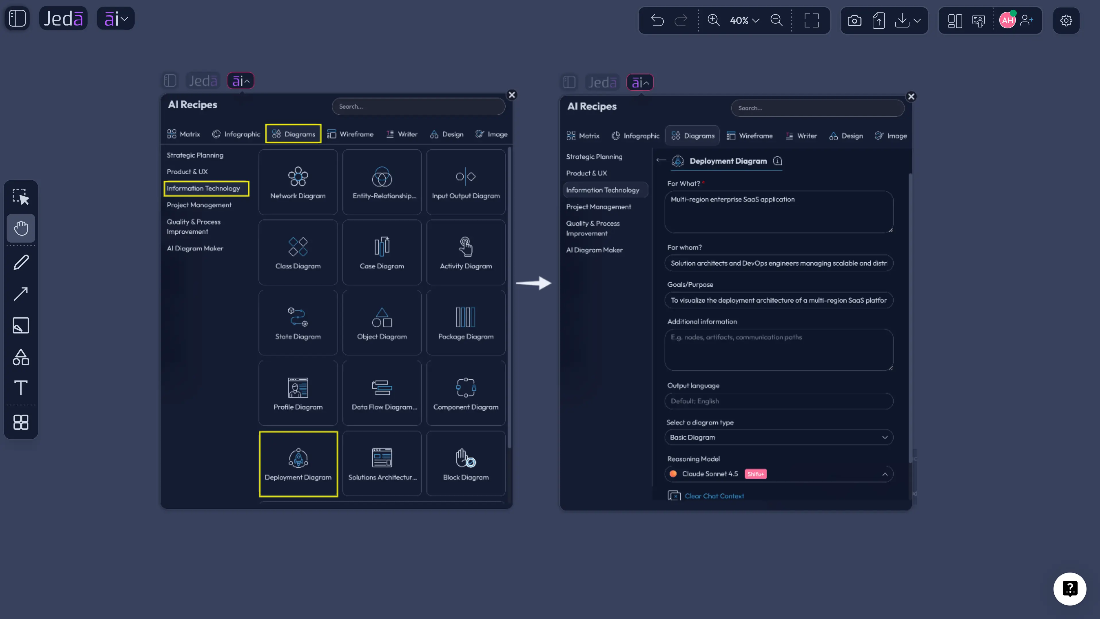
- Open the AI Menu
Start inside your Jeda.ai workspace and open the AI Menu from the top-left area of the canvas.
- Go to Diagram Recipes
Select the Diagrams category, then open the Information & Technology section and choose the Deployment Diagram recipe.
- Fill in For What and For Whom
Describe the system, platform, product, or environment. Then define the audience, such as software architects, DevOps engineers, SREs, product managers, business analysts, or implementation teams.
- Add goals and context
State the purpose of the diagram. For example: cloud migration planning, production architecture review, Kubernetes deployment mapping, multi-region failover, or client-facing system documentation.
- Choose layout and diagram type
Select a Horizontal or Vertical layout. Then choose Basic Diagram, Mind Map, or Flowchart depending on whether you need a runtime topology, exploration map, or deployment process view.
- Set web search and model options
Turn Web Search on when current cloud, vendor, or architecture context matters. Select the AI model or Multi-LLM Agent setup that fits the complexity of the architecture question.
- Generate and review the diagram
Create the first visual, then check node accuracy, artifact placement, communication paths, external dependencies, and environment boundaries directly on the canvas.
- Extend carefully with AI+
After the diagram exists, select a node or section and use AI+ to extend or deepen that selected area. Do not use AI+ as a separate instruction field for unrelated requests.
Method 2: Generate from the Prompt Bar
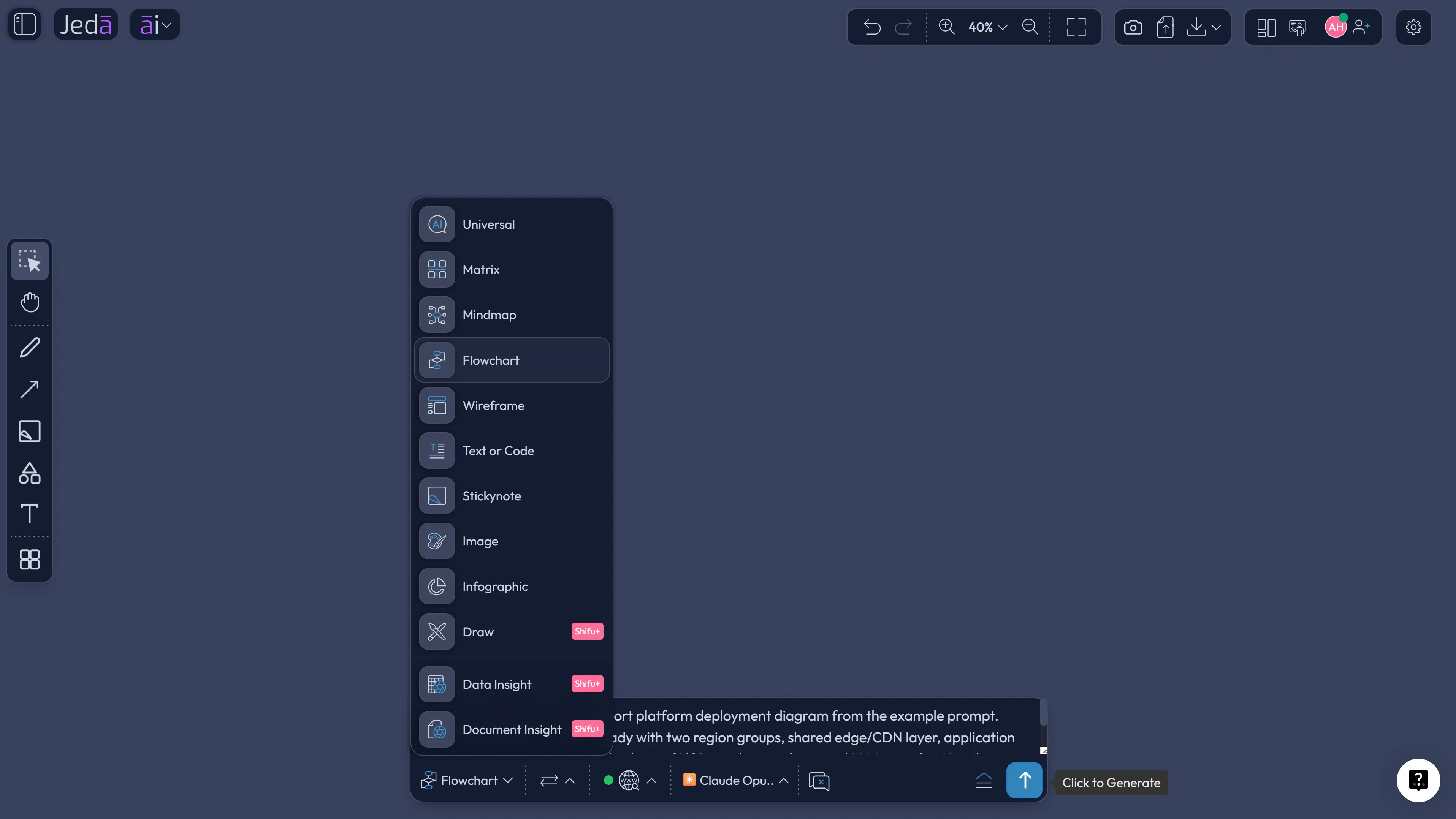
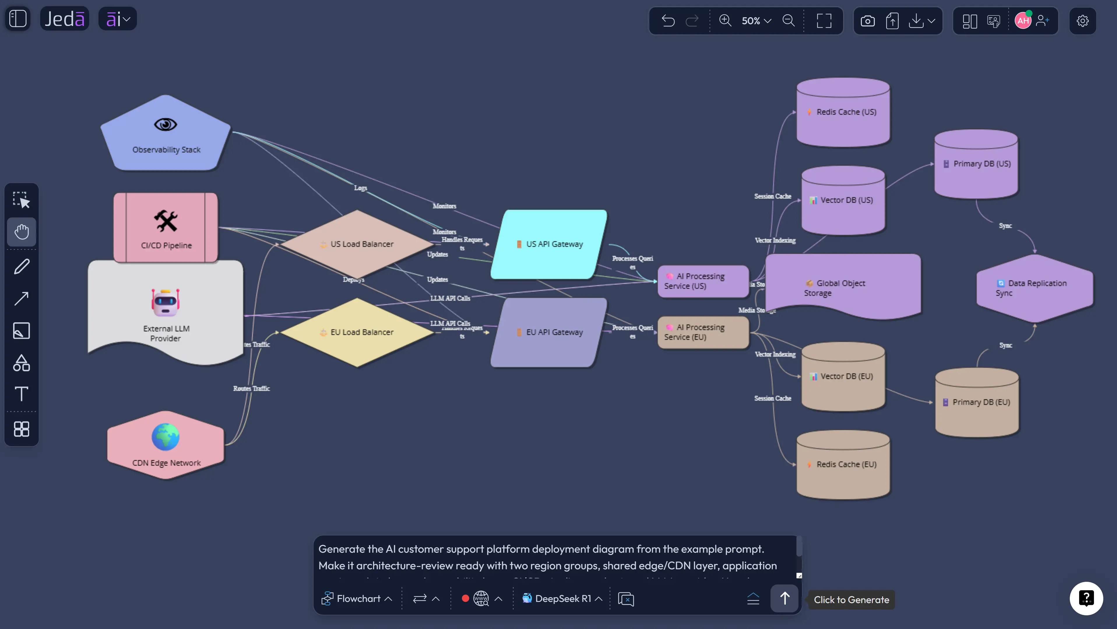
Use the Prompt Bar when you already have the architecture context and want a direct first draft. This is the speed path. It is useful for internal reviews, brainstorming, technical documentation, and turning a rough architecture description into a visual quickly.
Open the Prompt Bar at the bottom of the AI Workspace. Select the diagram output option available in your workspace, or choose the diagram-oriented generation path that produces a Basic Diagram. Then paste a clear deployment prompt. Ask for runtime nodes, artifacts, communication paths, environments, and external dependencies. Keep the prompt specific. “Create deployment diagram for app” is not a prompt. It is a shrug with a keyboard.
- Open the Prompt Bar
Use the bottom-center Prompt Bar as the direct input area for the deployment diagram request.
- Select the diagram output
Choose the Mind Map or Flowchart generation option available in your workspace.
- Write a specific architecture prompt
Name the system, users, environments, compute nodes, services, data stores, external APIs, CI/CD path, and constraints such as region, failover, security, or scale.
- Choose layout and model
Use horizontal layout for left-to-right runtime flow or vertical layout for layered infrastructure. Select the AI model setup that matches the complexity of the system.
- Generate the first version
Review the generated diagram on the canvas. Fix inaccurate labels, missing dependencies, vague nodes, or communication paths that need protocol or ownership detail.
- Refine after generation
Use normal canvas editing for shapes, text, and connectors. Use AI+ only to extend or deepen selected existing content, then use Vision Transform if you need another visual format.
Deployment Diagram Prompt Template
Use this structure when you want a stronger deployment diagram from the first pass:
Here is a worked example:
How to Review the AI Output Without Letting It Fool You
AI can produce a clean architecture diagram quickly. Clean is not the same as correct. Pretty boxes are cheap. Correct runtime mapping is the billable skill.
Run a review pass before you share the diagram:
This is where Jeda.ai’s AI Whiteboard workflow helps. The diagram remains editable. Your team can change connector styles, move nodes, adjust labels, add missing services, and keep the architecture conversation in the same workspace. No screenshot archaeology. No “which slide is current?” circus.
Where AI+ Fits After the Diagram Exists
AI+ is useful after the first deployment diagram is generated and reviewed. Select an existing node, group, service, environment, or section, then use AI+ to extend or deepen that selected content. For example, a database node could be expanded into related storage, backup, cache, and replication details. A CI/CD section could gain connected deployment stages. A monitoring node could grow into logs, metrics, traces, alerts, and dashboards.
But keep the expectation accurate: AI+ is not a place to ask a brand-new unrelated instruction. It extends selected content. That constraint is good. It keeps the workflow grounded in the diagram you already created instead of creating a second architecture story that wanders off into the bushes.
Best Practices for Deployment Diagrams with AI
A deployment diagram should help people act. That means it should support trade-off conversations, not just illustrate infrastructure.
For large systems, create more than one diagram. Start with a high-level deployment overview. Then create focused views for production, staging, CI/CD, observability, data flow, failover, and security boundaries. One giant diagram may feel impressive, but it often behaves like a junk drawer with arrows.
Use Web Search in the recipe when current vendor context matters. Use Multi-LLM Agent when the architecture has competing interpretations. Use Vision Transform when the same deployment needs to become a flowchart for release steps, a mind map for architecture review topics, or a diagram for stakeholder explanation.
And be honest about confidence. AI helps you draft. Humans still own truth.
Common Mistakes to Avoid
Mistake 1: Drawing logical components instead of deployed artifacts
A component diagram and a deployment diagram are not the same thing. If the diagram only shows “frontend,” “backend,” and “database,” it may be too abstract to guide deployment.
Mistake 2: Hiding environments
Production, staging, development, and disaster recovery may share patterns, but they rarely share every detail. Label environments clearly.
Mistake 3: Forgetting external systems
Payment gateways, LLM providers, identity providers, email services, analytics tools, and monitoring platforms affect reliability. Put them on the diagram.
Mistake 4: Skipping communication details
Do not draw mysterious arrows. Label key paths when protocols, direction, data movement, or network boundaries matter.
Mistake 5: Treating the first AI output as final
The first diagram is a draft. Review it like an architect, not like someone admiring a poster.
Frequently Asked Questions
- What is a Deployment Diagram with AI?
- A Deployment Diagram with AI is an AI-assisted visual map of where software artifacts run, which nodes or environments host them, and how those runtime elements communicate. In Jeda.ai, the diagram becomes editable on the canvas, so teams can refine it after generation.
- What is the best way to create a deployment diagram in Jeda.ai?
- The best method is the Deployment Diagram recipe under Diagram Recipes and the Information & Technology category. It gives you guided fields for the system, audience, goals, context, layout, web search, diagram type, and AI model selection.
- Can I generate a deployment diagram from the Prompt Bar?
- Yes. Use the Prompt Bar when you already know the architecture details. Select the diagram-oriented output available in your workspace (Flowchart/Mind Map), describe the system, include runtime nodes and artifacts, choose the layout and model, then generate the first editable diagram.
- What should a UML deployment diagram include?
- A UML deployment diagram usually includes nodes, devices, execution environments, deployed artifacts, communication paths, and deployment relationships. For cloud systems, add regions, zones, load balancers, data stores, queues, monitoring, identity, and external services when they affect runtime behavior.
- Is a deployment diagram the same as a component diagram?
- No. A component diagram shows logical software parts and relationships. A deployment diagram shows where deployable artifacts run in physical, virtual, or cloud infrastructure. Use both when you need a full architecture story.
- Should I choose Basic Diagram, Mind Map, or Flowchart?
- Choose Basic Diagram for the main deployment topology. Choose Mind Map when exploring architecture areas before finalizing the view. Choose Flowchart when the deployment story is about process, such as CI/CD, release gates, rollback logic, or incident response.
- How does Web Search help deployment diagrams?
- Web Search can ground the generation when current cloud, vendor, or architecture context matters. Use it when your deployment depends on fresh infrastructure terms, provider guidance, service names, or technical context that may have changed.
- How should AI+ be used with deployment diagrams?
- Use AI+ after the first diagram exists. Select a node, group, artifact, or section and let AI+ extend or deepen that selected area. Do not treat AI+ as a general prompt area for unrelated instructions.
- Can deployment diagrams help non-engineering stakeholders?
- Yes, if they are written clearly. Product managers, business analysts, and leaders can use deployment diagrams to understand system boundaries, external dependencies, risk areas, operating environments, and release impact without reading infrastructure code.
- Can I export a deployment diagram from Jeda.ai?
- Jeda.ai supports export paths such as PNG, SVG, and PDF depending on plan and workspace options. The useful part is that the diagram remains editable before export, so your team can refine the visual before sharing it.
Helpful Jeda.ai Links
- Explore the AI Workspace for visual thinking, strategy, analysis, and structured work.
- Use the AI Whiteboard when teams need an editable canvas for architecture, planning, and collaboration.
- Generate AI diagrams when your output needs connected shapes, relationships, and visual logic.
- Create AI flowcharts when the deployment story is more process-driven than topology-driven.
Sources & Further Reading
- [1]
Object Management Group (2017) . “Unified Modeling Language 2.5.1 Specification” OMG.
View Source ↗ - [2]
IBM (2026) . “Deployment diagrams in UML modeling” IBM Documentation.
View Source ↗ - [3]
Simon Brown (2026) . “C4 Model: Deployment Diagram” C4Model.com.
View Source ↗ - [4]
Amazon Web Services (2024) . “AWS Well-Architected Framework” AWS Documentation.
View Source ↗ - [5]
Microsoft (2025) . “Create architecture design diagrams” Microsoft Azure Well-Architected Framework.
View Source ↗ - [6]
Google Cloud (2026) . “Google Cloud Architecture Framework” Google Cloud Documentation.
View Source ↗
Create Your Deployment Diagram with AI
Join 150,000+ users using Jeda.ai to turn architecture, systems thinking, and technical planning into editable Visual AI diagrams.
Create a Deployment Diagram